How to present logo design concepts with Milanote
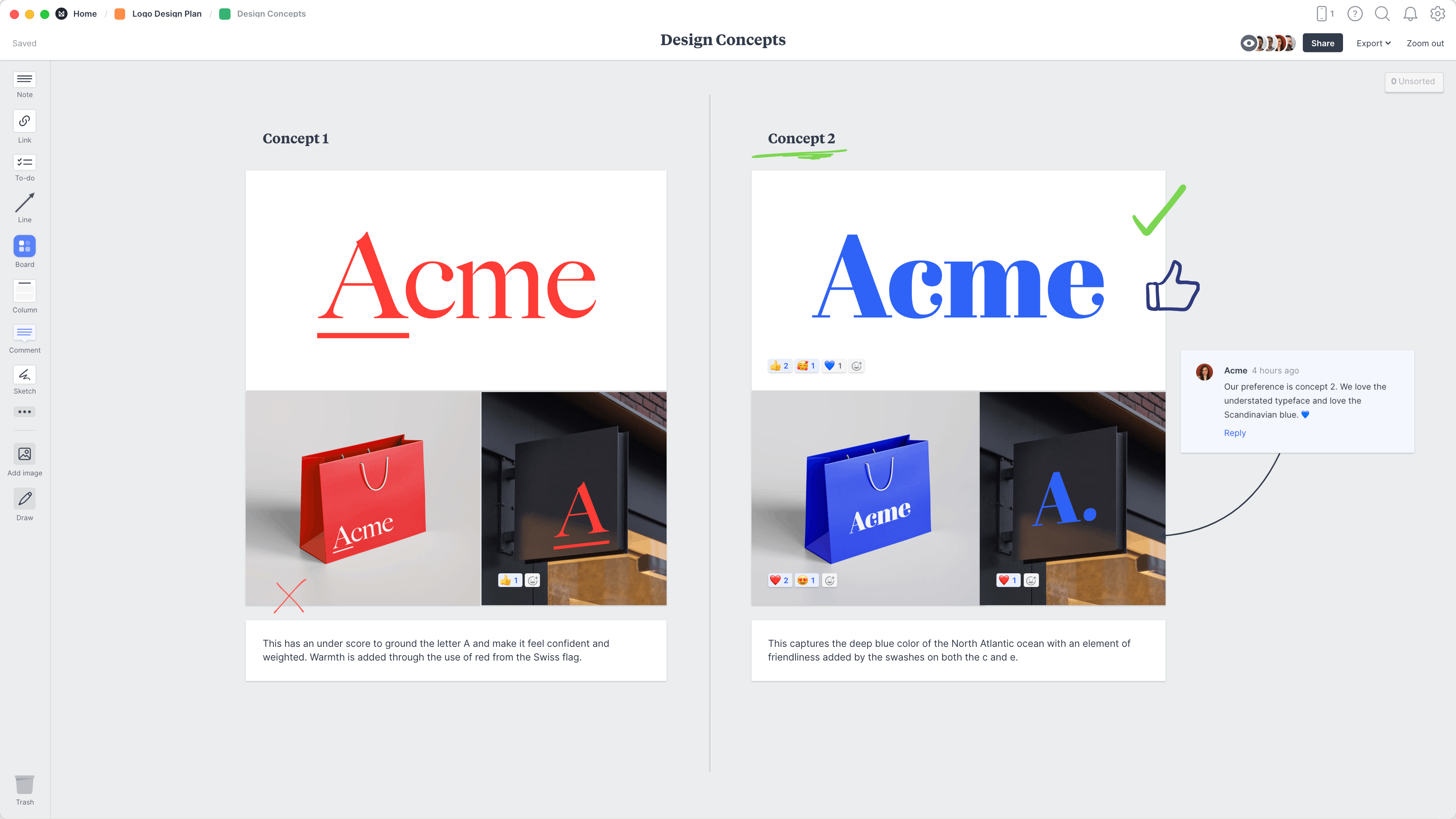
Follow this step-by-step guide to learn the modern process of presenting logo concepts in Milanote, a free tool used by top creatives.

How to present logo design concepts in 4 steps
How you present your design work is just as important as the actual artwork itself. It's here that you get to tell the story and strategy behind your work, not just share the final artwork.
Whether your logo presentation takes place in person or remotely, it's important to display your concepts in a way that's easy for others to compare and discuss, and most importantly shows your work in the best light.
In this guide, you'll learn the modern approach to presenting logo concepts and gathering feedback from your team and client using Milanote.
1. Arrange your logo concepts
Start by uploading the concepts you've designed so you can share them with your team or client. Provide a few examples of the logo in different environments. E.g. If it's a logo for a clothing brand, show how the logo will looks on its own, on store signage and on packaging or wrapping paper.
It's best to provide at least 2-3 different concepts so your team and client can start to debate which one best suits the business.

Create a new board to display your concepts.
Create a new board
Drag a board out from the toolbar. Give it a name, then double click to open it.
Drag files from your computer.
Upload a file or document
Click the "Upload" button or just drag a file onto your board. You can add images, logos, documents, videos, audio and much more.
2. Explain your thinking
Next, include some written notes about each concept. This will help explain your ideas and keep everything in context. Refer to the client's goals you set earlier in the Logo Brief and the visual direction from the Moodboard to communicate the path to this point.
Try to provide reasons why these concepts will provide the perfect visual brand for the client's company. Explain how they embody the brand personality and why they'll appeal to the target audience. Another useful approach here is to show how the logo concepts stand out against the competitors using the Brand Positioning Map format.
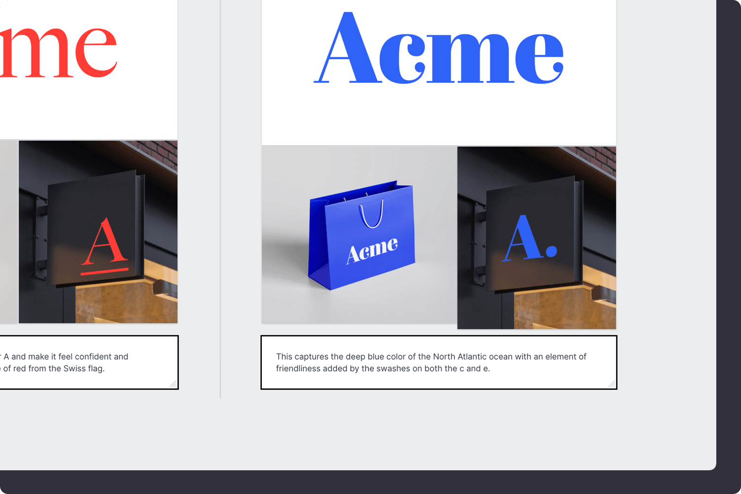
Add a note to describe each concept.
Drag a note card onto your board
Start typing then use the formatting tools in the left hand toolbar.
3. Share with your team or client
With any creative technique or project, it’s important to be open to constructive criticism. Now that you've prepared the initial concepts, it's time to ask for specific feedback. Share the board with your team or client and get together to choose a final direction.
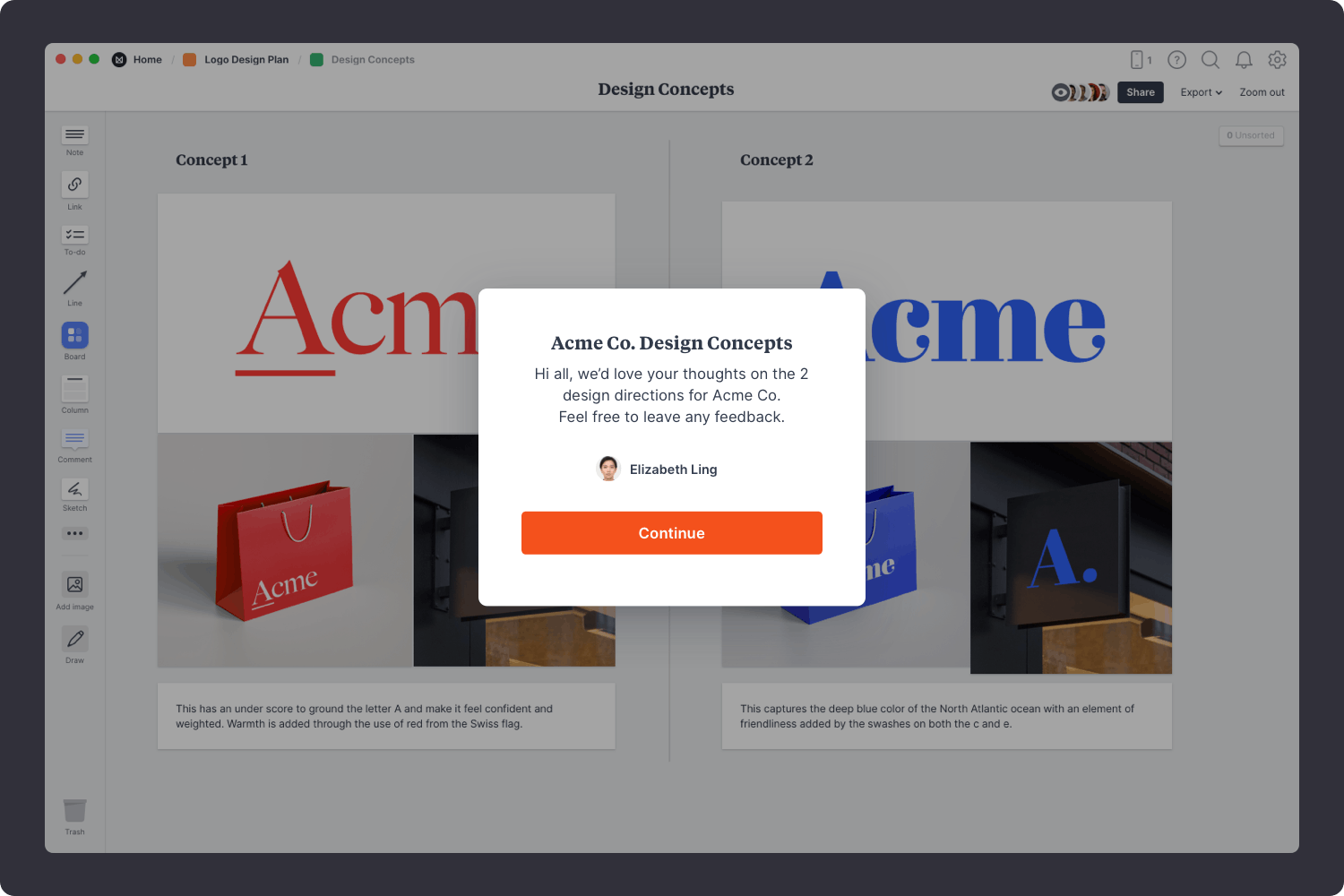
Share the concepts with your team.
Share a read-only link with others.
Click Share in the top right of your board. You can add a Welcome message for viewers, allow comments, set a password or embed the board in another app or website.
4. Agree on a concept
Ensure that everyone involved agrees on the concept direction before you start finalizing the logo artwork. Try to keep the conversation focused on the strategy behind the logo rather than discussing just the visual aspects. Consider how the logo addresses the goals, audience and requirements. Lastly, make sure you stay open to suggestions and improvements and try not to take criticism personally.

Start a conversation about the options.
Start a comment thread
Drag out a comment from the toolbar on the left and place it on your board. Other editors can reply to your comment.
Mention teammates to get their attention.
Mention teammates to get their attention
Type '@' in any text field to mention someone who has access to your board. They'll receive a notification and be able to respond to your comment.
Mark your favourites using reactions.
Add emoji reactions to your content
Select an image or note and choose "Add reaction" from the left toolbar.
You're done!
Hopefully at this point, one concept stands out as the obvious choice. Or perhaps this process has uncovered some valuable, clear feedback that will help you improve the logo even further. If you're just starting this process, use the template below to organize your logo concepts or read our full guide on How to plan a logo design project .

Start organizing your logo concepts
Get started for free with Milanote's easy to use logo presentation template.
Sign up for free with no time limit
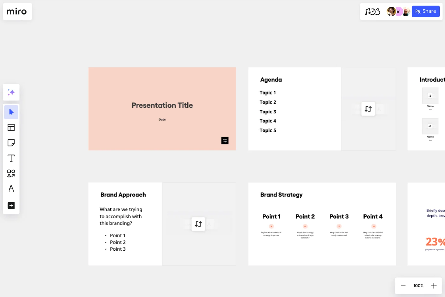
Logo Presentation Template
Present your design ideas with confidence and make your clients fall in love with their new logo.
About the Logo Presentation Template
This Logo Presentation Template helps you create the right context for your logo ideas and give them compelling backstories. You can use it to create presentations for your clients, colleagues, employees, or partners.
Help your audience recognize the relatability, beauty, and versatility of the new logo at a glance. Delight them by showing how it can help their brand become more recognizable and attractive to their target customers.
How to present a new logo
Sending over a PNG file with a logo on a white background won’t impress your clients — giving a stunning presentation will. Instead of making your clients wonder why they should change their branding at all, you can tell them a captivating story with your slides.
Delivering your logo design ideas in a professional way allows you to:
Highlight your expertise and skills and make your clients trust you and your design solutions more.
Convince your audience that the new logo is more compelling and won’t go out of style.
Show how the new logo can be used in different situations and on different media.
Help your clients overcome doubts and cut ties with the old brand identity.
What should be included in a logo presentation?
You don’t want to just present your logo — you want to amaze your audience and make them love the new concept. You can use mood boards or style scapes to convey the mood and show your sources of inspiration. It’ll add depth to your logo presentation and make it more emotive and engaging.
Your clients may have questions about the new logo applications, and you can answer them even before they arise. Add mockups to your presentation to demonstrate the new logo’s potential and how it will “behave” in real life. Put the new logo on merchandise, mobile apps, billboards, or public transport, depending on the niche and scale of your clients’ company.
How to use the Logo Presentation Template
Save time with Miro's easy-to-use presentation maker . You can prepare and assemble a pixel-perfect presentation in less than an hour, especially if you already know how you want to structure it. You can even use other Miro templates for brainstorming to speed up the ideation process and find more logo ideas with your team.
Step 1 . Prepare your mood boards, mockups, and other assets. Choose up to three of your boldest and most contrasting ideas. Make sure your logo works equally well in all sizes and on different materials, and outline the most important logo usage guidelines.
Step 2 . Choose this template and start customizing it. Add your branding, copy, and visuals. Show your logo in different sizes and on white and dark backgrounds. At this step, you can invite your colleagues to collaborate and share their thoughts on how formal or informal the presentation should be or how many slides to include.
Step 3 . When you’re done editing the template, switch to Presentation mode . It’s a full-screen view that lets you see your presentation exactly how your clients will see it, so it’s a good opportunity to spot and fix any minor mistakes. You don’t have to download or install anything to give a presentation — just always use Presentation mode whenever you need to use your slides.
The dos and don’ts of logo presentation
No matter how great your new logo is, the way you present it still plays a huge role. If you want to impress your audience, make sure to follow these best practices.
The dos of logo presentation:
Present your logo concept in person . You don’t want to distance yourself from your creative work. Presenting it in person also allows you to connect with your audience and address their concerns.
Show how you’ve arrived at the idea . Give your audience a glimpse of your design process and explain what influenced your decisions. You can also include their buyer personas in your presentation to remind your clients what this logo is for.
Explain why the new logo is better . Is it more relevant? Is it more memorable? You don’t have to make a side-by-side comparison, but it makes sense to list your new logo’s advantages using, for example, bullet points.
There are also some common mistakes to avoid.
The don'ts of logo presentation:
Don’t overwhelm your clients with too many ideas . Narrow down the list of possible design choices before you show it to your audience. Ideally, you should present no more than three of your most interesting design concepts.
Don’t assume your clients have the same aesthetic taste as you . Try to stay objective and explain what makes a great logo, why the new logo will work better in different situations, and why it’ll resonate with their target audience.
Don’t overexplain your logo . Avoid making your slides text-heavy — use mockups and other visuals to get your point across. Also, instead of defending your idea after the fact, try to predict your clients’ objections and handle them right in your presentation.
Who should give a logo presentation?
You can present your logo designs as a team, but it’s always better to have one person do most of the talking to help your audience focus. If you are a design agency, usually, it’s the art director’s job to present finished design projects. In any case, you need to position yourself as an expert and build trust with your clients — it’ll also help you justify your price tag.

What makes a terrific logo presentation?
When you present a logo, you need to avoid subjectivity and focus on the practical tasks you’re solving with your design. If your clients see that your design can help them attract a new target audience or increase revenue in some other way, they will grow to like it. Also, don’t ask for feedback right away — give them some time to digest your creative logo designs and discuss them with their peers. This way, your presentation will be impactful but not pushy.
Get started with this template right now.
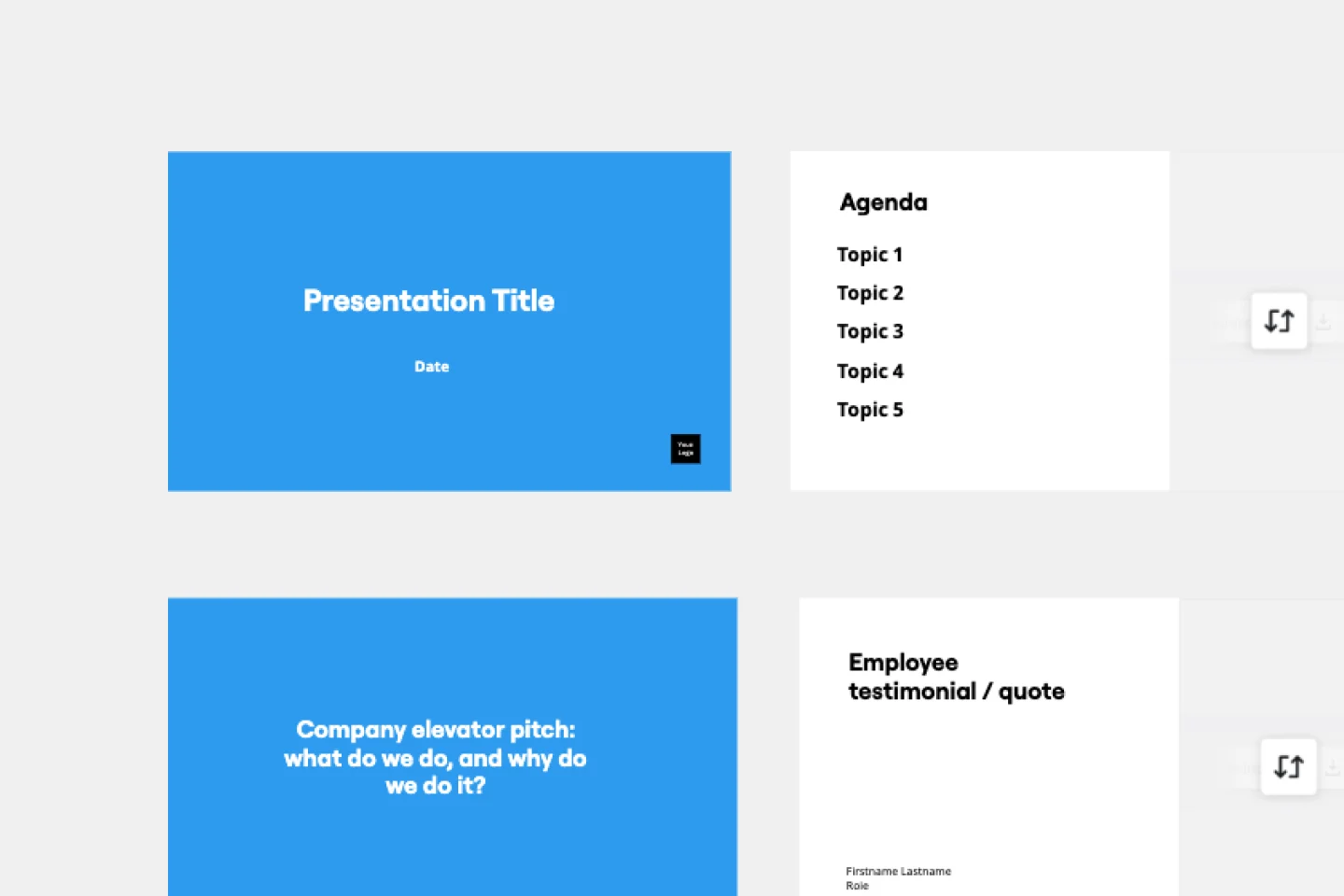
Company Vision Presentation Template
Works best for:.
Presentations, Business Management
Creating or reimagining a company vision is just half the battle. You also need to make sure that your employees and customers understand and share it. Communicate your vision statement in the most effective and concise way with this Company Vision Presentation Template.
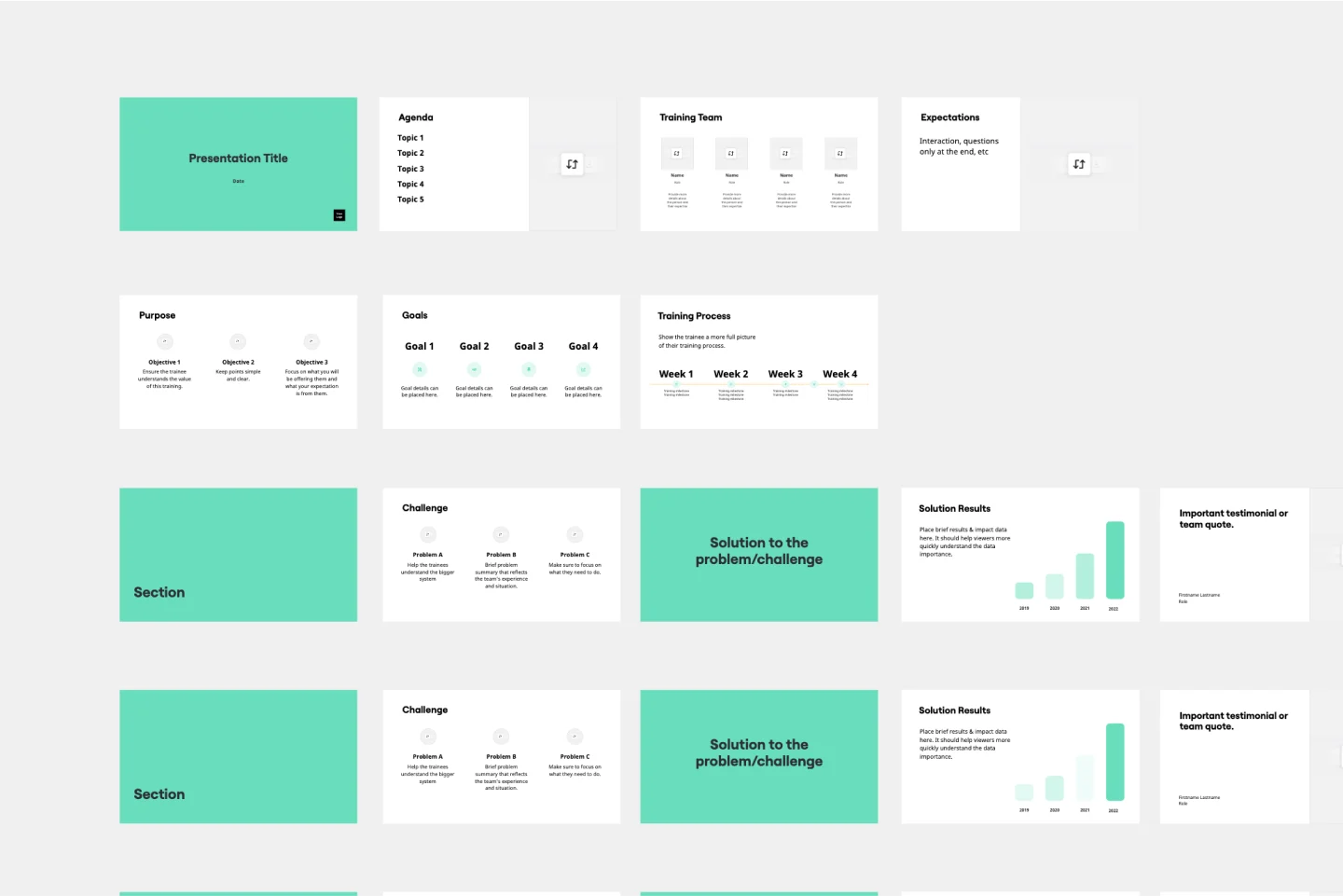
Training Presentation Template
Presentations, Education
Creating an engaging training presentation that effectively helps your employees level up is no easy feat. With the Training Presentation Template, you can slash presentation development time and spend more energy on the transformative elements of your training. Plus, it’s so easy to collaborate with other training staff when you develop your training slides in Miro.
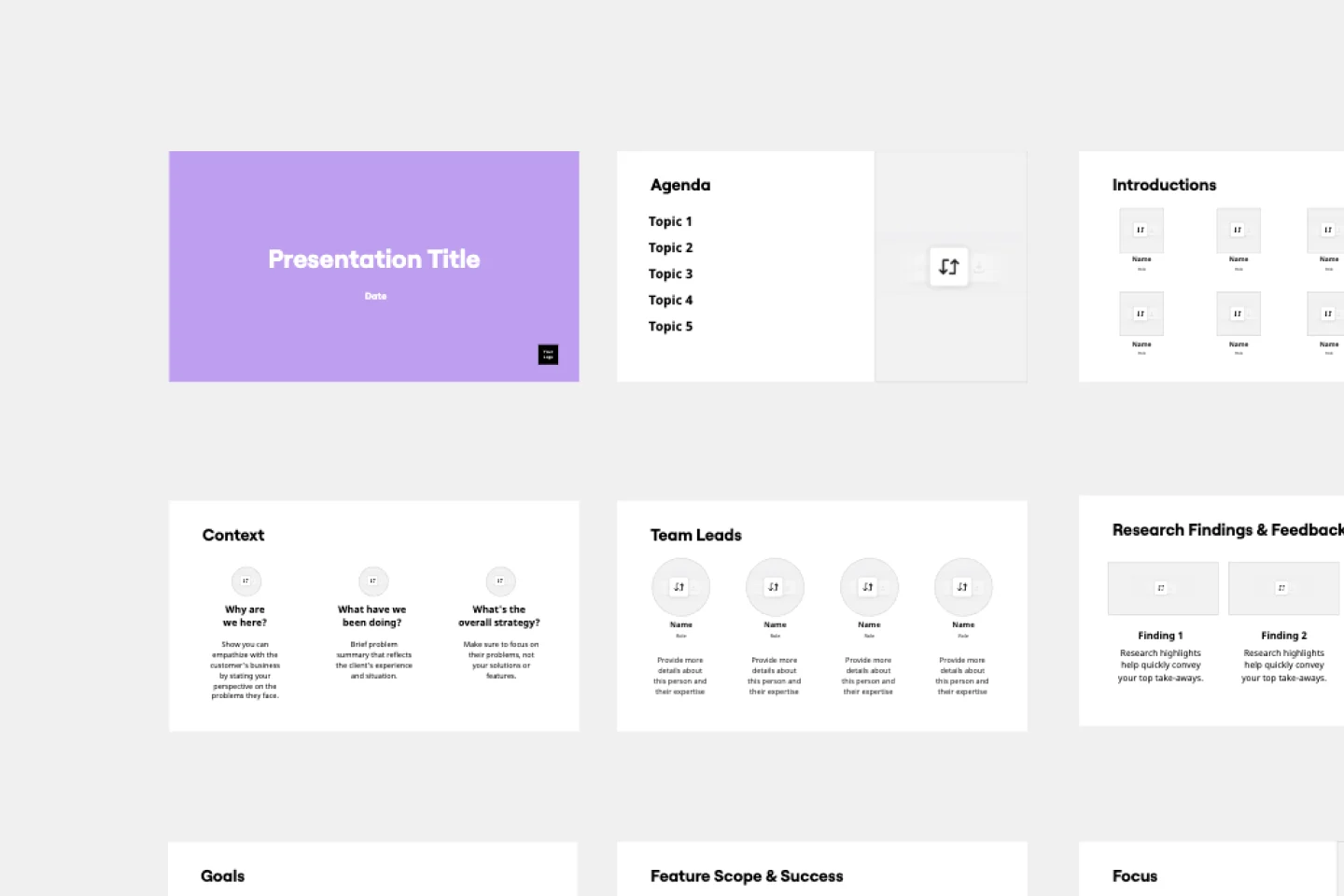
Demo Presentation Template
Presentations, Meetings
Present your ideas confidently and professionally with this Demo Presentation Template. Use it to show potential and existing customers how your product or service works so they can fully appreciate its value.
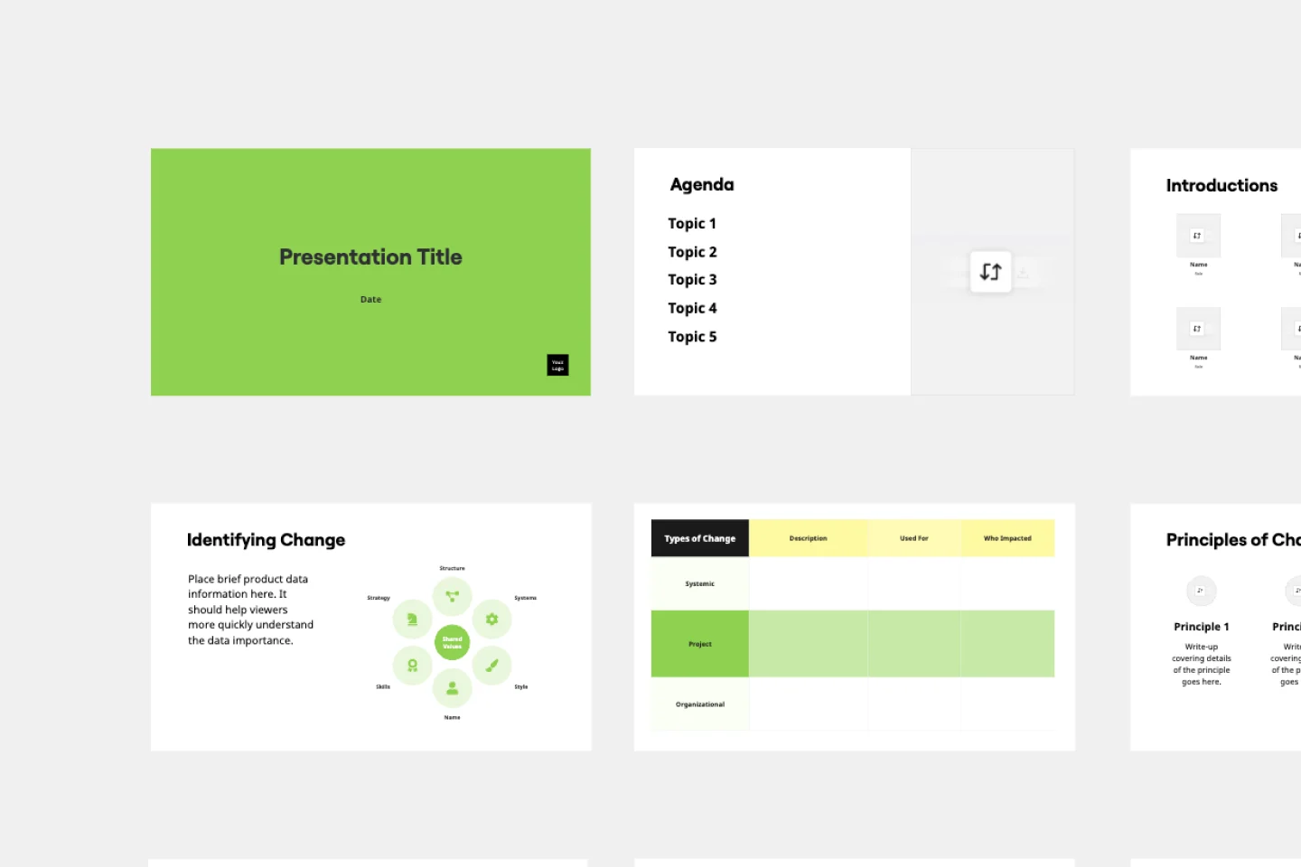
Change Management Presentation Template
Presentations, Strategic Planning
Employee resistance to change can block any positive initiative. You won’t have to struggle with it if you clearly communicate what upcoming changes mean and how they’ll benefit your company in the long run. Use our Change Management Presentation Template to outline your implementation strategy and spark enthusiasm among employees.
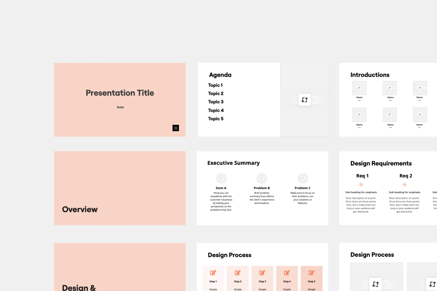
Critical Design Review Presentation Template
Presentations, UX Design
Use this template to finalize the design phase of a project. Keep all team members on the same page and ensure that your team’s technical efforts are on track.
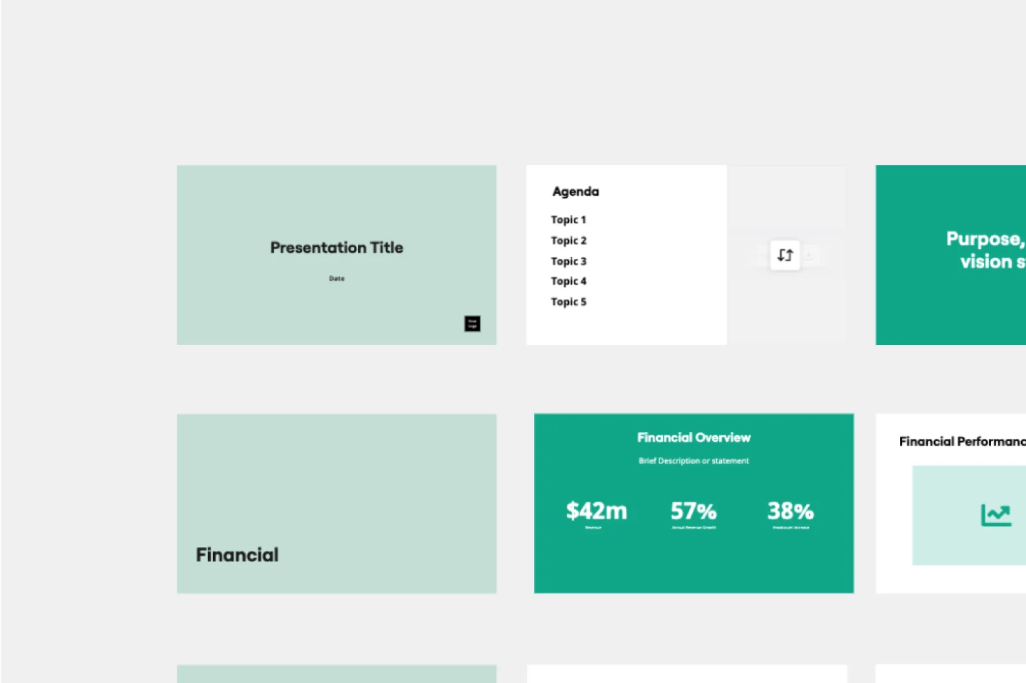
Annual Report Presentation Template
Trying to cut down on the time it takes to create a stunning yet professional annual report presentation to wow your stakeholders? Use this template to outline all the in-depth information about your company’s performance in an engaging and easy-to-digest way.
Plans and Pricing

10 Examples of a Professional Logo Presentation
Logo presentation, and leaving a great first impression is one of the crucial moments in every successful project. Your design may be solid, and you have researched it thoroughly. Still, if your presentation isn’t professional, you can have overly negative feedback. Every designer needs to have multiple logo presentation templates for every occasion and type of project. Here are some of the best examples that can make an impact on your workflow.
1. Blurred Background Image Logo Presentation
Here is one of the most straightforward ways to present your logo. Find an image that is related to your logo in some way. It could be a similar design idea, complementing shapes, or colors. Additionally, a great photo or an image will help you set the right mood. You can find thousands of royalty-free stock photos on websites like unsplash.com . All you have to do then is to apply your logo. Consider adding a blur effect on the background image to concentrate attention on the logo itself.

2. Visual Explanation of The Logo
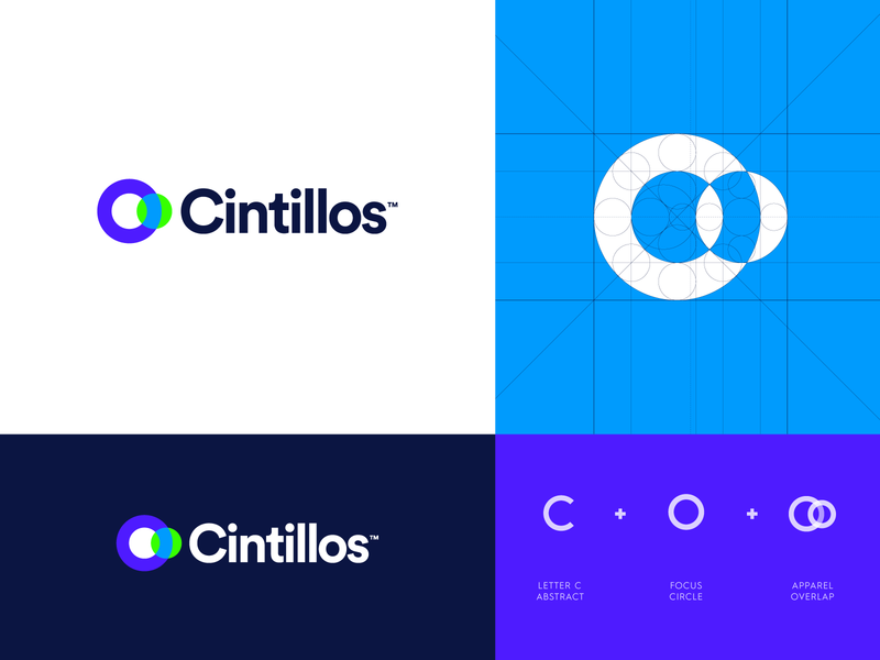
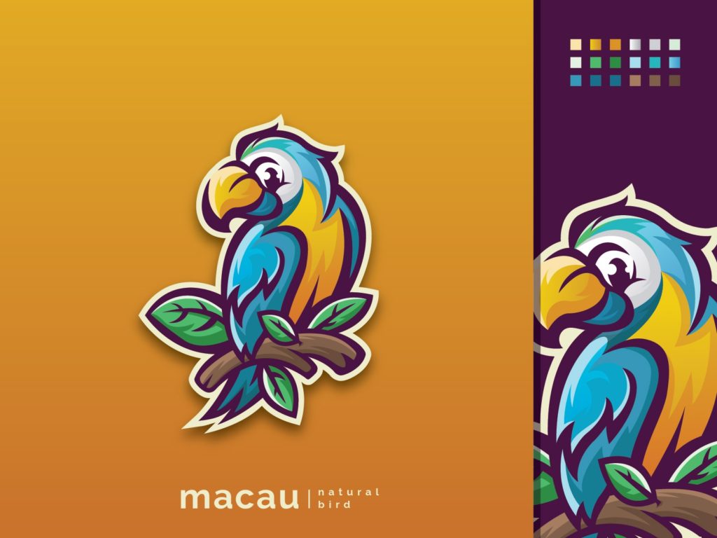
‘How did you come up with that?’ is a question many designers don’t like to hear. It isn’t very enjoyable to explain the whole process or a moment of inspiration when it comes to creative work. By presenting your work this way, you will be able to avoid that situation. Here we have an example of precisely that. The designer presented a primary logo, an inverted color logo, an outline grid, and a simple visual explanation with essential elements.
3. Inverted Color Options Presentation
Here is an option you can use that works excellent for mascots. Also, you can use it for logos meant to be used on various color backgrounds. This particular designer added just a bit of a drop shadow effect to make a mascot ‘pop’. On the right side of the screen is a mascot on a darker background, and of course, a color palette.
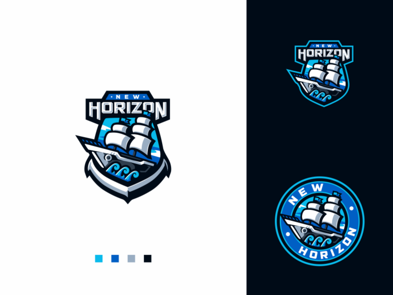
4. Multiple Logo Variations
Can’t decide which version of the logo looks better? Simply lay them all out on the artboard and let the client decide. This style of logo presentation works well if you already have to design multiple variations or styles (vertical, horizontal, inverted color, badge, etc.)
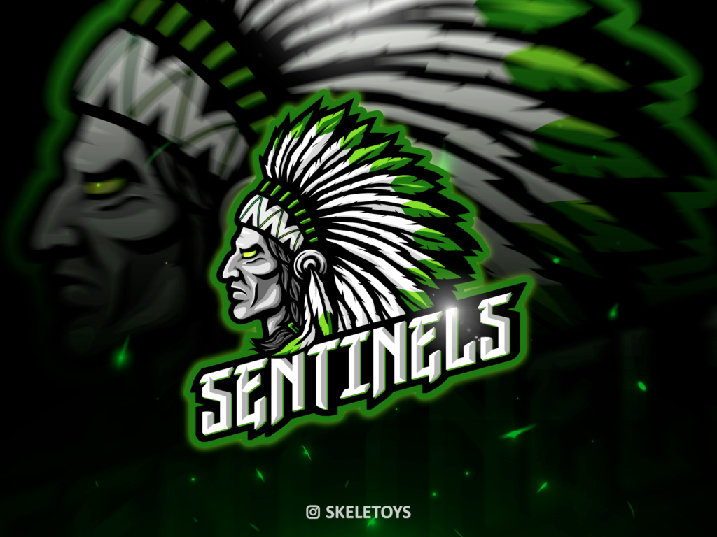
5. Background Logo with reduced opacity
Similar to adding a background image, adding the actual logo to the background will look even better. Scale the design, reduce opacity, and send it to the back.
6. Colored Bottom Line with Color Palette
This is one of the most straightforward ways to get away from the blank artboard. Present a nice and clean logo design is adding a colored bottom line. Not only that, but it can provide contrast and serve as a creative way to present the color palette used.

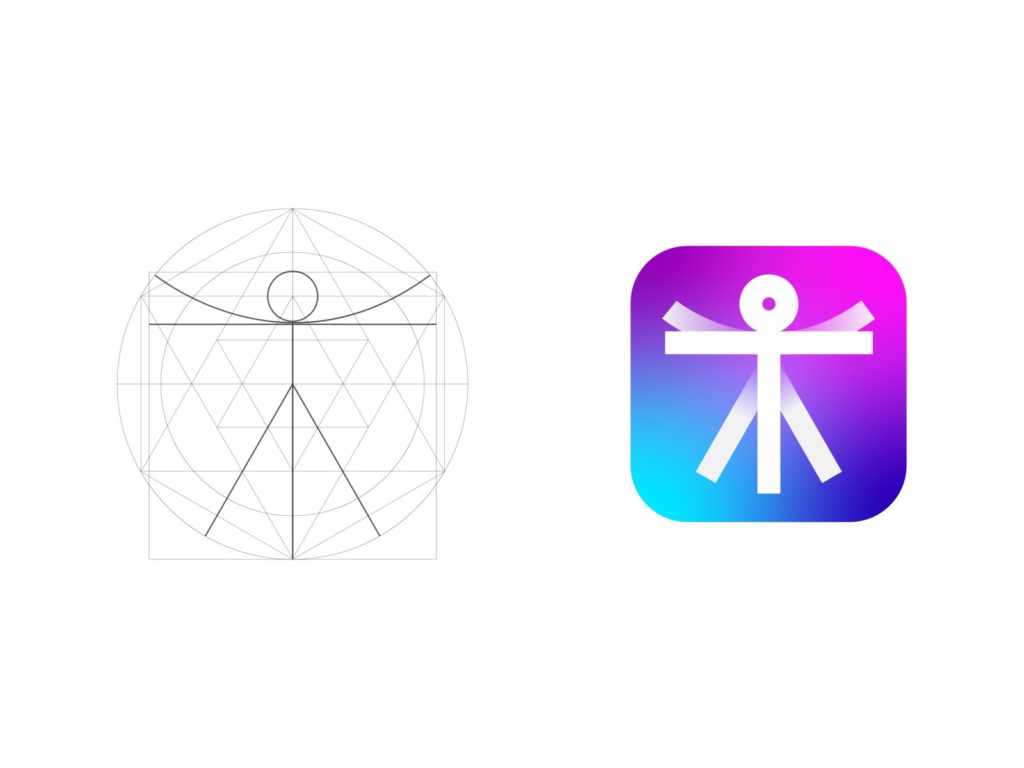
7. Logo Wireframe Presentation
Geometry is an essential factor when it comes to designing a logo. Then why shouldn’t you show how carefully planned out are your designs? It will help you show your work in a much more professional way. Feel free to make a beautiful logo presentation, with a finished product and initial wireframe right next to each other.
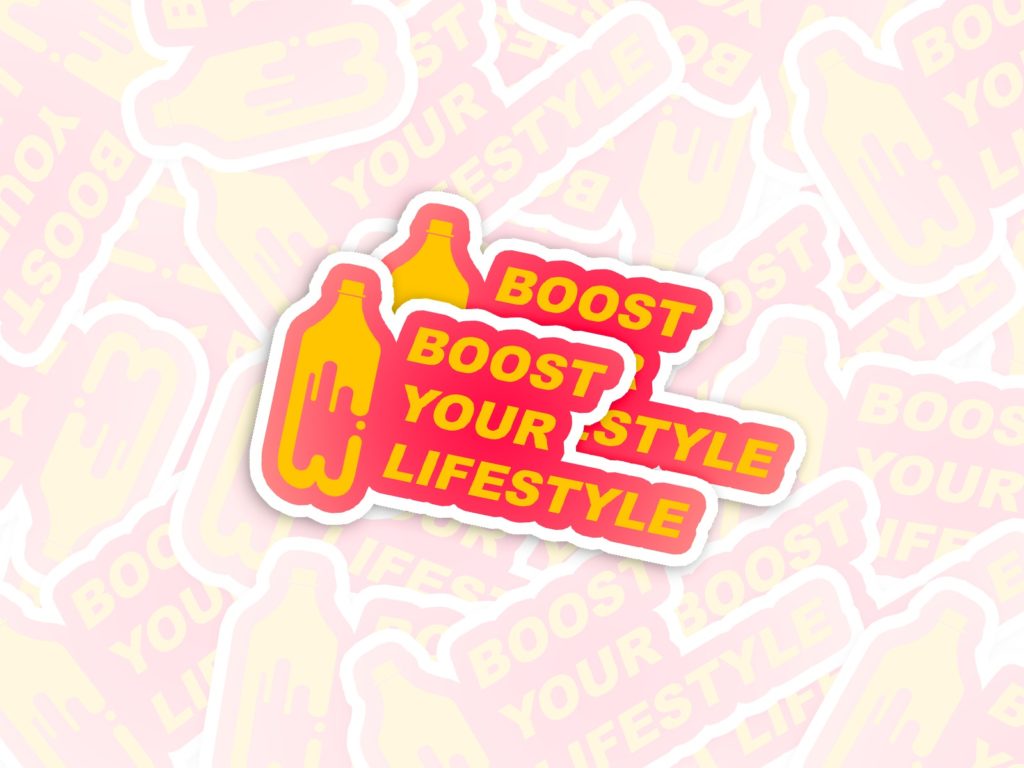
8. Sticker Bomb
Knowing where and how your design is going to be used is a big part of the process anyway. In this case, it is in the form of a sticker. Take that opportunity to present it as a sticker bomb. It will look more natural, and your client will love it!
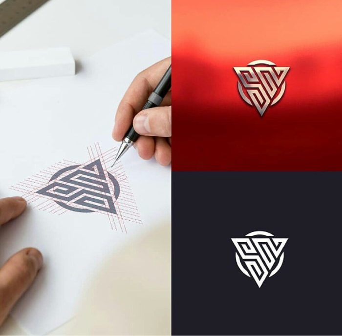
9. Logo Sketch
With a sketch of the logo with gridlines, 3D looking mockup, and simple white on black background, this logo presentation has it all. Keep in mind that sometimes less is more, and to use this way of presenting sparingly.
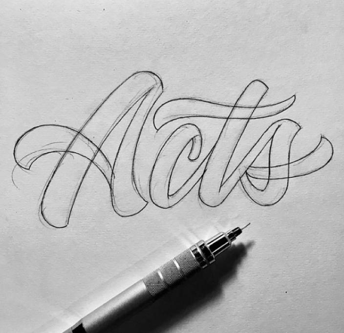
10. Hand Drawn Logo Sketch Presentation
Designers sometimes argue if sketching out your logo by hand first is necessary. Even more, if your client should ever see your sketches and initial ideas. However, this is the way to go if you are on an extremely tight schedule, or have to work with superficial information. It will help you get started and test out which direction to take before you fully commit and deliver a final presentation.
Grow Your Business with Web Design, Development and Branding
You may also like.
A Guide To Custom Web Design For Family Lawyer
Green Color in Branding
Leave a comment cancel reply.
Save my name, email, and website in this browser for the next time I comment.
