- Affiliate Program

- UNITED STATES
- 台灣 (TAIWAN)
- TÜRKIYE (TURKEY)
- Academic Editing Services
- - Research Paper
- - Journal Manuscript
- - Dissertation
- - College & University Assignments
- Admissions Editing Services
- - Application Essay
- - Personal Statement
- - Recommendation Letter
- - Cover Letter
- - CV/Resume
- Business Editing Services
- - Business Documents
- - Report & Brochure
- - Website & Blog
- Writer Editing Services
- - Script & Screenplay
- Our Editors
- Client Reviews
- Editing & Proofreading Prices
- Wordvice Points
- Partner Discount
- Plagiarism Checker
- APA Citation Generator
- MLA Citation Generator
- Chicago Citation Generator
- Vancouver Citation Generator
- - APA Style
- - MLA Style
- - Chicago Style
- - Vancouver Style
- Writing & Editing Guide
- Academic Resources
- Admissions Resources

How to Use Tables & Graphs in a Research Paper
It might not seem very relevant to the story and outcome of your study, but how you visually present your experimental or statistical results can play an important role during the review and publication process of your article. A presentation that is in line with the overall logical flow of your story helps you guide the reader effectively from your introduction to your conclusion.
If your results (and the way you organize and present them) don’t follow the story you outlined in the beginning, then you might confuse the reader and they might end up doubting the validity of your research, which can increase the chance of your manuscript being rejected at an early stage. This article illustrates the options you have when organizing and writing your results and will help you make the best choice for presenting your study data in a research paper.
Why does data visualization matter?
Your data and the results of your analysis are the core of your study. Of course, you need to put your findings and what you think your findings mean into words in the text of your article. But you also need to present the same information visually, in the results section of your manuscript, so that the reader can follow and verify that they agree with your observations and conclusions.
The way you visualize your data can either help the reader to comprehend quickly and identify the patterns you describe and the predictions you make, or it can leave them wondering what you are trying to say or whether your claims are supported by evidence. Different types of data therefore need to be presented in different ways, and whatever way you choose needs to be in line with your story.
Another thing to keep in mind is that many journals have specific rules or limitations (e.g., how many tables and graphs you are allowed to include, what kind of data needs to go on what kind of graph) and specific instructions on how to generate and format data tables and graphs (e.g., maximum number of subpanels, length and detail level of tables). In the following, we will go into the main points that you need to consider when organizing your data and writing your result section .
Table of Contents:
Types of data , when to use data tables .
- When to Use Data Graphs
Common Types of Graphs in Research Papers
Journal guidelines: what to consider before submission.
Depending on the aim of your research and the methods and procedures you use, your data can be quantitative or qualitative. Quantitative data, whether objective (e.g., size measurements) or subjective (e.g., rating one’s own happiness on a scale), is what is usually collected in experimental research. Quantitative data are expressed in numbers and analyzed with the most common statistical methods. Qualitative data, on the other hand, can consist of case studies or historical documents, or it can be collected through surveys and interviews. Qualitative data are expressed in words and needs to be categorized and interpreted to yield meaningful outcomes.
Quantitative data example: Height differences between two groups of participants Qualitative data example: Subjective feedback on the food quality in the work cafeteria
Depending on what kind of data you have collected and what story you want to tell with it, you have to find the best way of organizing and visualizing your results.
When you want to show the reader in detail how your independent and dependent variables interact, then a table (with data arranged in columns and rows) is your best choice. In a table, readers can look up exact values, compare those values between pairs or groups of related measurements (e.g., growth rates or outcomes of a medical procedure over several years), look at ranges and intervals, and select specific factors to search for patterns.
Tables are not restrained to a specific type of data or measurement. Since tables really need to be read, they activate the verbal system. This requires focus and some time (depending on how much data you are presenting), but it gives the reader the freedom to explore the data according to their own interest. Depending on your audience, this might be exactly what your readers want. If you explain and discuss all the variables that your table lists in detail in your manuscript text, then you definitely need to give the reader the chance to look at the details for themselves and follow your arguments. If your analysis only consists of simple t-tests to assess differences between two groups, you can report these results in the text (in this case: mean, standard deviation, t-statistic, and p-value), and do not necessarily need to include a table that simply states the same numbers again. If you did extensive analyses but focus on only part of that data (and clearly explain why, so that the reader does not think you forgot to talk about the rest), then a graph that illustrates and emphasizes the specific result or relationship that you consider the main point of your story might be a better choice.
When to Use Data Graphs
Graphs are a visual display of information and show the overall shape of your results rather than the details. If used correctly, a visual representation helps your (or your reader’s) brain to quickly understand large amounts of data and spot patterns, trends, and exceptions or outliers. Graphs also make it easier to illustrate relationships between entire data sets. This is why, when you analyze your results, you usually don’t just look at the numbers and the statistical values of your tests, but also at histograms, box plots, and distribution plots, to quickly get an overview of what is going on in your data.
Line graphs
When you want to illustrate a change over a continuous range or time, a line graph is your best choice. Changes in different groups or samples over the same range or time can be shown by lines of different colors or with different symbols.
Example: Let’s collapse across the different food types and look at the growth of our four fish species over time.
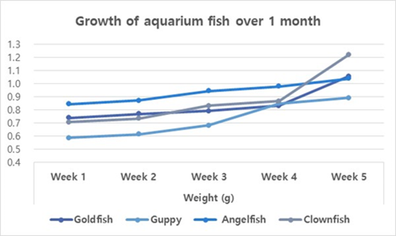
You should use a bar graph when your data is not continuous but divided into categories that are not necessarily connected, such as different samples, methods, or setups. In our example, the different fish types or the different types of food are such non-continuous categories.
Example: Let’s collapse across the food types again and also across time, and only compare the overall weight increase of our four fish types at the end of the feeding period.
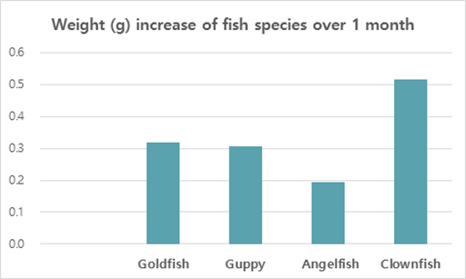
Scatter plots
Scatter plots can be used to illustrate the relationship between two variables — but note that both have to be continuous. The following example displays “fish length” as an additional variable–none of the variables in our table above (fish type, fish food, time) are continuous, and they can therefore not be used for this kind of graph.
As you see, these example graphs all contain less data than the table above, but they lead the reader to exactly the key point of your results or the finding you want to emphasize. If you let your readers search for these observations in a big table full of details that are not necessarily relevant to the claims you want to make, you can create unnecessary confusion. Most journals allow you to provide bigger datasets as supplementary information, and some even require you to upload all your raw data at submission. When you write up your manuscript, however, matching the data presentation to the storyline is more important than throwing everything you have at the reader.
Don’t forget that every graph needs to have clear x and y axis labels , a title that summarizes what is shown above the figure, and a descriptive legend/caption below. Since your caption needs to stand alone and the reader needs to be able to understand it without looking at the text, you need to explain what you measured/tested and spell out all labels and abbreviations you use in any of your graphs once more in the caption (even if you think the reader “should” remember everything by now, make it easy for them and guide them through your results once more). Have a look at this article if you need help on how to write strong and effective figure legends .
Even if you have thought about the data you have, the story you want to tell, and how to guide the reader most effectively through your results, you need to check whether the journal you plan to submit to has specific guidelines and limitations when it comes to tables and graphs. Some journals allow you to submit any tables and graphs initially (as long as tables are editable (for example in Word format, not an image) and graphs of high enough resolution.
Some others, however, have very specific instructions even at the submission stage, and almost all journals will ask you to follow their formatting guidelines once your manuscript is accepted. The closer your figures are already to those guidelines, the faster your article can be published. This PLOS One Figure Preparation Checklist is a good example of how extensive these instructions can be – don’t wait until the last minute to realize that you have to completely reorganize your results because your target journal does not accept tables above a certain length or graphs with more than 4 panels per figure.
Some things you should always pay attention to (and look at already published articles in the same journal if you are unsure or if the author instructions seem confusing) are the following:
- How many tables and graphs are you allowed to include?
- What file formats are you allowed to submit?
- Are there specific rules on resolution/dimension/file size?
- Should your figure files be uploaded separately or placed into the text?
- If figures are uploaded separately, do the files have to be named in a specific way?
- Are there rules on what fonts to use or to avoid and how to label subpanels?
- Are you allowed to use color? If not, make sure your data sets are distinguishable.
If you are dealing with digital image data, then it might also be a good idea to familiarize yourself with the difference between “adjusting” for clarity and visibility and image manipulation, which constitutes scientific misconduct . And to fully prepare your research paper for publication before submitting it, be sure to receive proofreading services , including journal manuscript editing and research paper editing , from Wordvice’s professional academic editors .

Figures and Charts
What this handout is about.
This handout will describe how to use figures and tables to present complicated information in a way that is accessible and understandable to your reader.
Do I need a figure/table?
When planning your writing, it is important to consider the best way to communicate information to your audience, especially if you plan to use data in the form of numbers, words, or images that will help you construct and support your argument. Generally speaking, data summaries may take the form of text, tables or figures. Most writers are familiar with textual data summaries and this is often the best way to communicate simple results. A good rule of thumb is to see if you can present your results clearly in a sentence or two. If so, a table or figure is probably unnecessary. If your data are too numerous or complicated to be described adequately in this amount of space, figures and tables can be effective ways of conveying lots of information without cluttering up your text. Additionally, they serve as quick references for your reader and can reveal trends, patterns, or relationships that might otherwise be difficult to grasp.
So what’s the difference between a table and a figure anyway?
Tables present lists of numbers or text in columns and can be used to synthesize existing literature, to explain variables, or to present the wording of survey questions. They are also used to make a paper or article more readable by removing numeric or listed data from the text. Tables are typically used to present raw data, not when you want to show a relationship between variables.
Figures are visual presentations of results. They come in the form of graphs, charts, drawings, photos, or maps. Figures provide visual impact and can effectively communicate your primary finding. Traditionally, they are used to display trends and patterns of relationship, but they can also be used to communicate processes or display complicated data simply. Figures should not duplicate the same information found in tables and vice versa.
Using tables
Tables are easily constructed using your word processor’s table function or a spread sheet program such as Excel. Elements of a table include the Legend or Title, Column Titles, and the Table Body (quantitative or qualitative data). They may also include subheadings and footnotes. Remember that it is just as important to think about the organization of tables as it is to think about the organization of paragraphs. A well-organized table allows readers to grasp the meaning of the data presented with ease, while a disorganized one will leave the reader confused about the data itself, or the significance of the data.
Title: Tables are headed by a number followed by a clear, descriptive title or caption. Conventions regarding title length and content vary by discipline. In the hard sciences, a lengthy explanation of table contents may be acceptable. In other disciplines, titles should be descriptive but short, and any explanation or interpretation of data should take place in the text. Be sure to look up examples from published papers within your discipline that you can use as a model. It may also help to think of the title as the “topic sentence” of the table—it tells the reader what the table is about and how it’s organized. Tables are read from the top down, so titles go above the body of the table and are left-justified.
Column titles: The goal of column headings is to simplify and clarify the table, allowing the reader to understand the components of the table quickly. Therefore, column titles should be brief and descriptive and should include units of analysis.
Table body: This is where your data are located, whether they are numerical or textual. Again, organize your table in a way that helps the reader understand the significance of the data. Be sure to think about what you want your readers to compare, and put that information in the column (up and down) rather than in the row (across). In other words, construct your table so that like elements read down, not across. When using numerical data with decimals, make sure that the decimal points line up. Whole numbers should line up on the right.
Other table elements
Tables should be labeled with a number preceding the table title; tables and figures are labeled independently of one another. Tables should also have lines demarcating different parts of the table (title, column headers, data, and footnotes if present). Gridlines or boxes should not be included in printed versions. Tables may or may not include other elements, such as subheadings or footnotes.
Quick reference for tables
Tables should be:
- Centered on the page.
- Numbered in the order they appear in the text.
- Referenced in the order they appear in the text.
- Labeled with the table number and descriptive title above the table.
- Labeled with column and/or row labels that describe the data, including units of measurement.
- Set apart from the text itself; text does not flow around the table.
Table 1. Physical characteristics of the Doctor in the new series of Doctor Who
Table 2. Physical characteristics of the Doctor in the new series of Doctor Who
Using figures
Figures can take many forms. They may be graphs, diagrams, photos, drawings, or maps. Think deliberately about your purpose and use common sense to choose the most effective figure for communicating the main point. If you want your reader to understand spatial relationships, a map or photograph may be the best choice. If you want to illustrate proportions, experiment with a pie chart or bar graph. If you want to illustrate the relationship between two variables, try a line graph or a scatterplot (more on various types of graphs below). Although there are many types of figures, like tables, they share some typical features: captions, the image itself, and any necessary contextual information (which will vary depending on the type of figure you use).
Figure captions
Figures should be labeled with a number followed by a descriptive caption or title. Captions should be concise but comprehensive. They should describe the data shown, draw attention to important features contained within the figure, and may sometimes also include interpretations of the data. Figures are typically read from the bottom up, so captions go below the figure and are left-justified.
The most important consideration for figures is simplicity. Choose images the viewer can grasp and interpret clearly and quickly. Consider size, resolution, color, and prominence of important features. Figures should be large enough and of sufficient resolution for the viewer to make out details without straining their eyes. Also consider the format your paper will ultimately take. Journals typically publish figures in black and white, so any information coded by color will be lost to the reader. On the other hand, color might be a good choice for papers published to the web or for PowerPoint presentations. In any case, use figure elements like color, line, and pattern for effect, not for flash.
Additional information
Figures should be labeled with a number preceding the table title; tables and figures are numbered independently of one another. Also be sure to include any additional contextual information your viewer needs to understand the figure. For graphs, this may include labels, a legend explaining symbols, and vertical or horizontal tick marks. For maps, you’ll need to include a scale and north arrow. If you’re unsure about contextual information, check out several types of figures that are commonly used in your discipline.
Quick reference for figures
Figures should be:
- Labeled (under the figure) with the figure number and appropriate descriptive title (“Figure” can be spelled out [“Figure 1.”] or abbreviated [“Fig. 1.”] as long as you are consistent).
- Referenced in the order they appear in the text (i.e. Figure 1 is referenced in the text before Figure 2 and so forth).
- Set apart from the text; text should not flow around figures.
Every graph is a figure but not every figure is a graph. Graphs are a particular set of figures that display quantitative relationships between variables. Some of the most common graphs include bar charts, frequency histograms, pie charts, scatter plots, and line graphs, each of which displays trends or relationships within and among datasets in a different way. You’ll need to carefully choose the best graph for your data and the relationship that you want to show. More details about some common graph types are provided below. Some good advice regarding the construction of graphs is to keep it simple. Remember that the main objective of your graph is communication. If your viewer is unable to visually decode your graph, then you have failed to communicate the information contained within it.
Pie charts are used to show relative proportions, specifically the relationship of a number of parts to the whole. Use pie charts only when the parts of the pie are mutually exclusive categories and the sum of parts adds up to a meaningful whole (100% of something). Pie charts are good at showing “big picture” relationships (i.e. some categories make up “a lot” or “a little” of the whole thing). However, if you want your reader to discern fine distinctions within your data, the pie chart is not for you. Humans are not very good at making comparisons based on angles. We are much better at comparing length, so try a bar chart as an alternative way to show relative proportions. Additionally, pie charts with lots of little slices or slices of very different sizes are difficult to read, so limit yours to 5-7 categories.
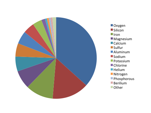
The chart shows the relative proportion of fifteen elements in Martian soil, listed in order from “most” to “least”: oxygen, silicon, iron, magnesium, calcium, sulfur, aluminum, sodium, potassium, chlorine, helium, nitrogen, phosphorus, beryllium, and other. Oxygen makes up about ⅓ of the composition, while silicon and iron together make up about ¼. The remaining slices make up smaller proportions, but the percentages aren’t listed in the key and are difficult to estimate. It is also hard to distinguish fifteen colors when comparing the pie chart to the color coded key.
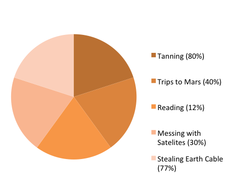
The chart shows the relative proportion of five leisure activities of Venusian teenagers (tanning, trips to Mars, reading, messing with satellites, and stealing Earth cable). Although each of the five slices are about the same size (roughly 20% of the total), the percentage of Venusian teenagers engaging in each activity varies widely (tanning: 80%, trips to Mars: 40%, reading: 12%, messing with satellites: 30%, stealing Earth cable: 77%). Therefore, there is a mismatch between the labels and the actual proportion represented by each activity (in other words, if reading represents 12% of the total, its slice should take up 12% of the pie chart area), which makes the representation inaccurate. In addition, the labels for the five slices add up to 239% (rather than 100%), which makes it impossible to accurately represent this dataset using a pie chart.
Bar graphs are also used to display proportions. In particular, they are useful for showing the relationship between independent and dependent variables, where the independent variables are discrete (often nominal) categories. Some examples are occupation, gender, and species. Bar graphs can be vertical or horizontal. In a vertical bar graph the independent variable is shown on the x axis (left to right) and the dependent variable on the y axis (up and down). In a horizontal one, the dependent variable will be shown on the horizontal (x) axis, the independent on the vertical (y) axis. The scale and origin of the graph should be meaningful. If the dependent (numeric) variable has a natural zero point, it is commonly used as a point of origin for the bar chart. However, zero is not always the best choice. You should experiment with both origin and scale to best show the relevant trends in your data without misleading the viewer in terms of the strength or extent of those trends.
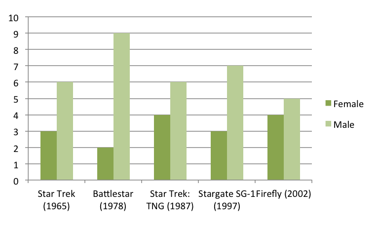
The graph shows the number of male and female spaceship crew members for five different popular television series: Star Trek (1965), Battlestar (1978), Star Trek: TNG (1987), Stargate SG-1 (1997), and Firefly (2002). Because the television series are arranged chronologically on the x-axis, the graph can also be used to look for trends in these numbers over time.
Although the number of crew members for each show is similar (ranging from 9 to 11), the proportion of female and male crew members varies. Star Trek has half as many female crew members as male crew members (3 and 6, respectively), Battlestar has fewer than one-fourth as many female crew members as male crew members (2 and 9, respectively), Star Trek: TNG has four female crew members and six male crew members, Stargate SG-1 has less than one-half as many female crew members as male crew members (3 and 7, respectively), and Firefly has four female and five male crew members.
Frequency histograms/distributions
Frequency histograms are a special type of bar graph that show the relationship between independent and dependent variables, where the independent variable is continuous, rather than discrete. This means that each bar represents a range of values, rather than a single observation. The dependent variables in a histogram are always numeric, but may be absolute (counts) or relative (percentages). Frequency histograms are good for describing populations—examples include the distribution of exam scores for students in a class or the age distribution of the people living in Chapel Hill. You can experiment with bar ranges (also known as “bins”) to achieve the best level of detail, but each range or bin should be of uniform width and clearly labeled.
XY scatter plots
Scatter plots are another way to illustrate the relationship between two variables. In this case, data are displayed as points in an x,y coordinate system, where each point represents one observation along two axes of variation. Often, scatter plots are used to illustrate correlation between two variables—as one variable increases, the other increases (positive correlation) or decreases (negative correlation). However, correlation does not necessarily imply that changes in one variable cause changes in the other. For instance, a third, unplotted variable may be causing both. In other words, scatter plots can be used to graph one independent and one dependent variable, or they can be used to plot two independent variables. In cases where one variable is dependent on another (for example, height depends partly on age), plot the independent variable on the horizontal (x) axis, and the dependent variable on the vertical (y) axis. In addition to correlation (a linear relationship), scatter plots can be used to plot non-linear relationships between variables.
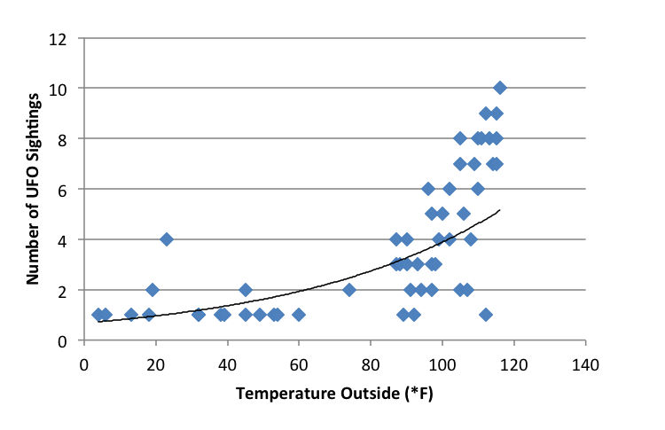
The scatter plot shows the relationship between temperature (x-axis, independent variable) and the number of UFO sightings (y-axis, dependent variable) for 53 separate data points. The temperature ranges from about 0°F and 120°F, and the number of UFO sightings ranges from 1 to 10. The plot shows a low number of UFO sightings (ranging from 1 to 4) at temperatures below 80°F and a much wider range of the number of sightings (from 1 to 10) at temperatures above 80°F. It appears that the number of sightings tends to increase as temperature increases, though there are many cases where only a few sightings occur at high temperatures.
XY line graphs
Line graphs are similar to scatter plots in that they display data along two axes of variation. Line graphs, however, plot a series of related values that depict a change in one variable as a function of another, for example, world population (dependent) over time (independent). Individual data points are joined by a line, drawing the viewer’s attention to local change between adjacent points, as well as to larger trends in the data. Line graphs are similar to bar graphs, but are better at showing the rate of change between two points. Line graphs can also be used to compare multiple dependent variables by plotting multiple lines on the same graph.
Example of an XY line graph:
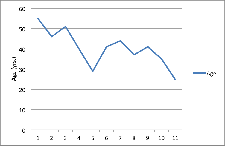
The line graph shows the age (in years) of the actor of each Doctor Who regeneration for the first through the eleventh regeneration. The ages range from a maximum of about 55 in the first regeneration to a minimum of about 25 in the eleventh regeneration. There is a downward trend in the age of the actors over the course of the eleven regenerations.
General tips for graphs
Strive for simplicity. Your data will be complex. Don’t be tempted to convey the complexity of your data in graphical form. Your job (and the job of your graph) is to communicate the most important thing about the data. Think of graphs like you think of paragraphs—if you have several important things to say about your data, make several graphs, each of which highlights one important point you want to make.
Strive for clarity. Make sure that your data are portrayed in a way that is visually clear. Make sure that you have explained the elements of the graph clearly. Consider your audience. Will your reader be familiar with the type of figure you are using (such as a boxplot)? If not, or if you’re not sure, you may need to explain boxplot conventions in the text. Avoid “chartjunk.” Superfluous elements just make graphs visually confusing. Your reader does not want to spend 15 minutes figuring out the point of your graph.
Strive for accuracy. Carefully check your graph for errors. Even a simple graphical error can change the meaning and interpretation of the data. Use graphs responsibly. Don’t manipulate the data so that it looks like it’s saying something it’s not—savvy viewers will see through this ruse, and you will come off as incompetent at best and dishonest at worst.
How should tables and figures interact with text?
Placement of figures and tables within the text is discipline-specific. In manuscripts (such as lab reports and drafts) it is conventional to put tables and figures on separate pages from the text, as near as possible to the place where you first refer to it. You can also put all the figures and tables at the end of the paper to avoid breaking up the text. Figures and tables may also be embedded in the text, as long as the text itself isn’t broken up into small chunks. Complex raw data is conventionally presented in an appendix. Be sure to check on conventions for the placement of figures and tables in your discipline.
You can use text to guide the reader in interpreting the information included in a figure, table, or graph—tell the reader what the figure or table conveys and why it was important to include it.
When referring to tables and graphs from within the text, you can use:
- Clauses beginning with “as”: “As shown in Table 1, …”
- Passive voice: “Results are shown in Table 1.”
- Active voice (if appropriate for your discipline): “Table 1 shows that …”
- Parentheses: “Each sample tested positive for three nutrients (Table 1).”
Works consulted
We consulted these works while writing this handout. This is not a comprehensive list of resources on the handout’s topic, and we encourage you to do your own research to find additional publications. Please do not use this list as a model for the format of your own reference list, as it may not match the citation style you are using. For guidance on formatting citations, please see the UNC Libraries citation tutorial . We revise these tips periodically and welcome feedback.
American Psychological Association. 2010. Publication Manual of the American Psychological Association . 6th ed. Washington, DC: American Psychological Association.
Bates College. 2012. “ Almost everything you wanted to know about making tables and figures.” How to Write a Paper in Scientific Journal Style and Format , January 11, 2012. http://abacus.bates.edu/~ganderso/biology/resources/writing/HTWtablefigs.html.
Cleveland, William S. 1994. The Elements of Graphing Data , 2nd ed. Summit, NJ: Hobart Press..
Council of Science Editors. 2014. Scientific Style and Format: The CSE Manual for Authors, Editors, and Publishers , 8th ed. Chicago & London: University of Chicago Press.
University of Chicago Press. 2017. The Chicago Manual of Style , 17th ed. Chicago & London: University of Chicago Press.
You may reproduce it for non-commercial use if you use the entire handout and attribute the source: The Writing Center, University of North Carolina at Chapel Hill
Make a Gift

Effective Use of Tables and Figures in Research Papers
Research papers are often based on copious amounts of data that can be summarized and easily read through tables and graphs. When writing a research paper , it is important for data to be presented to the reader in a visually appealing way. The data in figures and tables, however, should not be a repetition of the data found in the text. There are many ways of presenting data in tables and figures, governed by a few simple rules. An APA research paper and MLA research paper both require tables and figures, but the rules around them are different. When writing a research paper, the importance of tables and figures cannot be underestimated. How do you know if you need a table or figure? The rule of thumb is that if you cannot present your data in one or two sentences, then you need a table .
Using Tables
Tables are easily created using programs such as Excel. Tables and figures in scientific papers are wonderful ways of presenting data. Effective data presentation in research papers requires understanding your reader and the elements that comprise a table. Tables have several elements, including the legend, column titles, and body. As with academic writing, it is also just as important to structure tables so that readers can easily understand them. Tables that are disorganized or otherwise confusing will make the reader lose interest in your work.
- Title: Tables should have a clear, descriptive title, which functions as the “topic sentence” of the table. The titles can be lengthy or short, depending on the discipline.
- Column Titles: The goal of these title headings is to simplify the table. The reader’s attention moves from the title to the column title sequentially. A good set of column titles will allow the reader to quickly grasp what the table is about.
- Table Body: This is the main area of the table where numerical or textual data is located. Construct your table so that elements read from up to down, and not across.
Related: Done organizing your research data effectively in tables? Check out this post on tips for citing tables in your manuscript now!
The placement of figures and tables should be at the center of the page. It should be properly referenced and ordered in the number that it appears in the text. In addition, tables should be set apart from the text. Text wrapping should not be used. Sometimes, tables and figures are presented after the references in selected journals.
Using Figures
Figures can take many forms, such as bar graphs, frequency histograms, scatterplots, drawings, maps, etc. When using figures in a research paper, always think of your reader. What is the easiest figure for your reader to understand? How can you present the data in the simplest and most effective way? For instance, a photograph may be the best choice if you want your reader to understand spatial relationships.
- Figure Captions: Figures should be numbered and have descriptive titles or captions. The captions should be succinct enough to understand at the first glance. Captions are placed under the figure and are left justified.
- Image: Choose an image that is simple and easily understandable. Consider the size, resolution, and the image’s overall visual attractiveness.
- Additional Information: Illustrations in manuscripts are numbered separately from tables. Include any information that the reader needs to understand your figure, such as legends.
Common Errors in Research Papers
Effective data presentation in research papers requires understanding the common errors that make data presentation ineffective. These common mistakes include using the wrong type of figure for the data. For instance, using a scatterplot instead of a bar graph for showing levels of hydration is a mistake. Another common mistake is that some authors tend to italicize the table number. Remember, only the table title should be italicized . Another common mistake is failing to attribute the table. If the table/figure is from another source, simply put “ Note. Adapted from…” underneath the table. This should help avoid any issues with plagiarism.
Using tables and figures in research papers is essential for the paper’s readability. The reader is given a chance to understand data through visual content. When writing a research paper, these elements should be considered as part of good research writing. APA research papers, MLA research papers, and other manuscripts require visual content if the data is too complex or voluminous. The importance of tables and graphs is underscored by the main purpose of writing, and that is to be understood.
Frequently Asked Questions
"Consider the following points when creating figures for research papers: Determine purpose: Clarify the message or information to be conveyed. Choose figure type: Select the appropriate type for data representation. Prepare and organize data: Collect and arrange accurate and relevant data. Select software: Use suitable software for figure creation and editing. Design figure: Focus on clarity, labeling, and visual elements. Create the figure: Plot data or generate the figure using the chosen software. Label and annotate: Clearly identify and explain all elements in the figure. Review and revise: Verify accuracy, coherence, and alignment with the paper. Format and export: Adjust format to meet publication guidelines and export as suitable file."
"To create tables for a research paper, follow these steps: 1) Determine the purpose and information to be conveyed. 2) Plan the layout, including rows, columns, and headings. 3) Use spreadsheet software like Excel to design and format the table. 4) Input accurate data into cells, aligning it logically. 5) Include column and row headers for context. 6) Format the table for readability using consistent styles. 7) Add a descriptive title and caption to summarize and provide context. 8) Number and reference the table in the paper. 9) Review and revise for accuracy and clarity before finalizing."
"Including figures in a research paper enhances clarity and visual appeal. Follow these steps: Determine the need for figures based on data trends or to explain complex processes. Choose the right type of figure, such as graphs, charts, or images, to convey your message effectively. Create or obtain the figure, properly citing the source if needed. Number and caption each figure, providing concise and informative descriptions. Place figures logically in the paper and reference them in the text. Format and label figures clearly for better understanding. Provide detailed figure captions to aid comprehension. Cite the source for non-original figures or images. Review and revise figures for accuracy and consistency."
"Research papers use various types of tables to present data: Descriptive tables: Summarize main data characteristics, often presenting demographic information. Frequency tables: Display distribution of categorical variables, showing counts or percentages in different categories. Cross-tabulation tables: Explore relationships between categorical variables by presenting joint frequencies or percentages. Summary statistics tables: Present key statistics (mean, standard deviation, etc.) for numerical variables. Comparative tables: Compare different groups or conditions, displaying key statistics side by side. Correlation or regression tables: Display results of statistical analyses, such as coefficients and p-values. Longitudinal or time-series tables: Show data collected over multiple time points with columns for periods and rows for variables/subjects. Data matrix tables: Present raw data or matrices, common in experimental psychology or biology. Label tables clearly, include titles, and use footnotes or captions for explanations."
Enago is a very useful site. It covers nearly all topics of research writing and publishing in a simple, clear, attractive way. Though I’m a journal editor having much knowledge and training in these issues, I always find something new in this site. Thank you
“Thank You, your contents really help me :)”
Rate this article Cancel Reply
Your email address will not be published.

Enago Academy's Most Popular Articles
- Reporting Research
Explanatory & Response Variable in Statistics — A quick guide for early career researchers!
Often researchers have a difficult time choosing the parameters and variables (like explanatory and response…

- Manuscript Preparation
- Publishing Research
How to Use Creative Data Visualization Techniques for Easy Comprehension of Qualitative Research
“A picture is worth a thousand words!”—an adage used so often stands true even whilst…

- Figures & Tables
Effective Use of Statistics in Research – Methods and Tools for Data Analysis
Remember that impending feeling you get when you are asked to analyze your data! Now…
- Old Webinars
- Webinar Mobile App
SCI中稿技巧: 提升研究数据的说服力
如何寻找原创研究课题 快速定位目标文献的有效搜索策略 如何根据期刊指南准备手稿的对应部分 论文手稿语言润色实用技巧分享,快速提高论文质量
Distill: A Journal With Interactive Images for Machine Learning Research
Research is a wide and extensive field of study. This field has welcomed a plethora…
Explanatory & Response Variable in Statistics — A quick guide for early career…
How to Create and Use Gantt Charts

Sign-up to read more
Subscribe for free to get unrestricted access to all our resources on research writing and academic publishing including:
- 2000+ blog articles
- 50+ Webinars
- 10+ Expert podcasts
- 50+ Infographics
- 10+ Checklists
- Research Guides
We hate spam too. We promise to protect your privacy and never spam you.
- Industry News
- AI in Academia
- Promoting Research
- Career Corner
- Diversity and Inclusion
- Infographics
- Expert Video Library
- Other Resources
- Enago Learn
- Upcoming & On-Demand Webinars
- Open Access Week 2024
- Peer Review Week 2024
- Publication Integrity Week 2024
- Conference Videos
- Enago Report
- Journal Finder
- Enago Plagiarism & AI Grammar Check
- Editing Services
- Publication Support Services
- Research Impact
- Translation Services
- Publication solutions
- AI-Based Solutions
- Thought Leadership
- Call for Articles
- Call for Speakers
- Author Training
- Edit Profile
I am looking for Editing/ Proofreading services for my manuscript Tentative date of next journal submission:

Which among these would you prefer the most for improving research integrity?

Formatting Graphics and Visuals in APA Style
Statistics and results from data analysis are often best presented in the form of a table, and a theoretical model or pages of information are often best presented in a well-designed visual such as a chart or graph. The American Psychological Association (APA) distinguishes between two types of visuals: tables and figures. Both are used to provide a large amount of information concisely and to promote greater understanding of a text. This article explains how to format tables and figures according to APA Style 7th Edition.
Tables in APA Style (7th ed.)
Tables are organized in a row and column format and provide information that is not already given in the text. Tables should also be able to stand alone and be understandable without the accompanying text. Therefore, having a descriptive title for the table is important and so is using a “note” to explain any symbols, abbreviations, or asterisks used in the table.
When inserting a table in your work, include the following information (also exemplified by Table 1):
- Table number , aligned left, bolded, and presented in sequence: Table 1 , Table 2 , etc.
- Table title , aligned left, italicized, and offering a brief description the table: Title of Table
- The table itself , without shading or vertical borders; use horizontal boarders only for clarity such as a top and bottom border or to separate a row containing the sums of column data. Tables are double spaced unless one or one and a half spacing would enable the table to be displayed on a single page.
- Table note , double-spaced below the table, after the label “note” in italics: Note .
Use a callout such as “See Table 1” in the paragraph before the table to point the reader to it.

Table Notes
Table notes are only used when needed, and there can be up to three notes per table, ordered by type:
- General Note : General notes are given first. Table 1 in this article has a general note. General notes provide definitions, keys, and copyright statements for any information that came from a source.
- Specific Note : Specific notes provide information about individual columns or rows. If, for example, a specific column or cell’s data needed explanation, a superscript letter such as “a” would be placed by the data, e.g. Xa, and the same superscript letter would be placed before the note about it.
- Probability Note : Probability notes explain asterisks (*) or other symbols that provide probability values used in statistical hypothesis testing used for ruling out something occurring due to chance alone.
- In statistical testing, researchers use a probability level between 0 to 1 to describe the chance of an event occurring, with 0 meaning the event will never occur and 1 meaning the event will always occur. In a table or figure, probability levels are assigned asterisks to indicate a range in probability such as p < .05 and * p < .01, and ***p < .001 (APA, 2020). The fewest number of asterisks indicates the largest probability and the greatest number of asterisks indicates the smallest probability level.
- Plus (+) and minus (-) signs are also used in probability notes to show confidence intervals. For example, the results of an opinion poll may show 56% of the respondents prefer candidate A. If the confidence interval is +/-3, then 53%-59% of the population agrees with those sampled.
- Probability notes may also provide confidence levels to indicate how certain the researcher is that the general population will agree with the poll respondents. For example, if the confidence level is 95%, then there is a 95% certainty that 53% to 59% of the population agrees with those polled. Researchers typically use a 95% confidence level.
Example of a general note, specific note, and probability note:
Note . The poll revealed that respondents prefer candidate A. YA = ages 18-30. A = ages 31-43. Adapted from “Title of Article,” by A. Author, Copyright Year, Publication Title, vol(issue) page-page. (URL). Copyright year by Copyright holder or Copyright License or In the public domain.
Data are for all genders.
p < .05. * p < .01.
In the example above, the notes are to be double spaced as shown in Table 1, and each type of note begins on a new line with the first note providing general information about the table including a copyright note for the data used in the table. The second note gives specific information about the data in the rows, and the third note provides the probability (p) values.
Reference Entries for Table Data
A reference entry would also be included for any source of information used in the table and noted in the table note. The reference entry goes on a reference list at the end of the paper.
Table Checklist
- Is the table necessary?
- Is the table mentioned in the text?
- Is the table inserted under the paragraph where it is first mentioned?
- Is the title brief but explanatory and one double-spaced line below the table number?
- Are all vertical borders in the table eliminated?
- Does every column have a heading including?
- Are the notes in the following order: general note, specific note, probability note?
- Are the notes double spaced?
- Are all abbreviations, symbols, and special uses of dashes, italics, or boldface explained in a note?
- If the table is for statistical testing, are probability levels identified?
- If more than one table is used, are probability level asterisks consistent from table to table?
- With statistical testing data, are confidence intervals reported and consistent for all tables?
- If all or part of a copyrighted table is reproduced or adapted, does the general table note give full credit to the copyright owner and have a corresponding reference entry?
Figures in APA Style (7th ed.)
Figures include visuals such as charts graphs, pictures, maps, etc. When inserting a figure in your work, include the following information (also exemplified in Figure 1):
- Figure # , aligned left, bolded, and in sequence: Figure 1 , Figure 2 , etc.
- Figure title , aligned left, italicized, and offering a brief description the table: Figure Title
- The figure itself
- Figure note , double-spaced below the table after the label “note” in italics: Note .
Use a callout such as “See Figure 1” in the paragraph before the figure to point the reader to it.

The Chart tool in Microsoft Word and Microsoft PowerPoint provides options for various types of graphs and charts. With so many types to choose from, it’s important to carefully consider which type will best present the information. For example,
• a column chart displays categories of variables; • a bar chart demonstrates comparisons between single items; • a pie chart shows percentages; • a scatter plot illustrates correlations; and • a line graph demonstrates relationships.
The Microsoft Office Support webpage provides examples of these types of charts and more.
Figure Notes
As with tables, there can be up to three notes under the figure, ordered by type: (a) general information about the figure including a copyright statement for compiled data or images from the Internet, (b) specific information about individual sections, bars, graphs, or other elements of the figure, and (c)) probability explanations as discussed in the section on tables.
Copyright Statements for Compiled Data
When you use data and information in your table or figure that was compiled from research, the figure must contain a general note with a copyright statement identifying the copyright holder of that information. Because you are using this information for an academic purpose that is not for profit, you will not need to also acquire permission from the copyholder. It is considered “fair use” for students and scholars to use information that has been previously published if the information is attributed to the copyright holder with proper documentation.
Use the following copyright statement template in a note for data or information that came from a journal or book:
Journal : Note . From [or Adapted from] “Title of Article,” by A. A. Author, year, Journal Title, Volume (Issue), p. xx (DOI or URL). Copyright year by Name of Copyright Holder or In the public domain or Copyright License such as CC BY-NC .
Book : Note . From [or Adapted from] Title of Book (p. xx), by A. A. Author, year, Publisher (DOI or URL). Copyright year by Name of Copyright Holder or In the public domain or CC BY-NC .
Copyright Statements for Images
Images are different than compiled data. Depending on where the image is from, it may or may not require a copyright statement in a note under the image.
Copyrighted images : To use a copyrighted photograph, permission from the copyright holder is needed. It is an act of plagiarism to use a copyrighted image without permission.
Copyright statement template for copyrighted image that you have permission to use:
From [or Adapted from]. Title of Work [Photograph], by A. A. Author, year of publication, Site Name (URL). Copyright year by Name of Copyright holder. Reprinted or Adapted with permission.
Creative Commons licensed images : Photographs with Creative Commons licenses may be used without permission, but each type of Creative Commons license has different stipulations. You can read about each here: https://creativecommons.org/licenses/ . The licenses generally all require attribution to the source or creator of the image. (See Figure 2).
Copyright statement for Creative Commons image:
From [or Adapted from]. Title of Work [Photograph], by A. A. Author, year of publication, Site Name (URL). License such as CC BY-NC .
Photograph With a Creative Commons License for Reproduction With Attribution

Note . From Lilies After Rain [Photograph], by C. Cairns, 2015, Flicker. (https://flic.kr/p/vDHife) . CC BY 2.0 .
Public Domain images : Public domain works are not protected by copyright law or they have expired copyrights such as works published before January 1, 1924. In APA Style, works in the public domain are credited in a copyright statement in the note. (See Figure 3).
Copyright statement for image in the public domain:
From [or Adapted from]. Title of Work [Photograph], by A. A. Author, year of publication, Site Name (URL). In the public domain.
Photograph in the Public Domain

Note . From Study for The Cellist [Photograph], by A. Modigliani, 1909, Abcgallery (http://www.abcgallery.com/M/modigliani/modigliani12.html) . In the public domain.
Free Photos Online: Some photo sites allow for reproduction of images without attribution to the source or creator of that image. Sites such as Pixabay , Pexels , and Unsplash , for example, provide images that do not require attribution. A copyright statement is not needed for these images.
Reference Entries for Figures
In addition to a copyright attribution, include a reference entry for any source credited in a figure note. Below is the APA Style (7th ed.) reference entry template for a photograph:
Author last name, First initial. Middle initial. (year). Title of photograph [Photograph]. Site or Source Name. URL

Figure Checklist
- Is the figure necessary?
- Is the resolution of the image clear enough to be read and understood?
- Is the figure mentioned in the paper’s text?
- Is the figure inserted under the paragraph where it is first mentioned?
- Does the text explain how the figure is relevant to the discussion in the paper without repeating all the information from the figure in the text?
- Does the figure title provide a brief explanation?
- Are all elements of the figure clearly labeled?
- Are all figures numbered consecutively?
- Is proper credit given to the source of the figure in the figure note?
- Has a reference entry been provided for the source of the figure?
American Psychological Association. (2020). Publication manual of the American Psychological Association: The official guide to APA style (7th ed.). https://doi.org/10.1037/0000165-000
© 2020 by Purdue Global Academic Success Center and Writing Center
Share this:
- Click to email a link to a friend (Opens in new window)
- Click to share on Facebook (Opens in new window)
- Click to share on Reddit (Opens in new window)
- Click to share on Twitter (Opens in new window)
- Click to share on LinkedIn (Opens in new window)
- Click to share on Pinterest (Opens in new window)
- Click to print (Opens in new window)
3 Responses
- Pingbacks 0
What size should the visual be in the actual paper? I have students ask this, and frequently their visuals cover half an entire page, but I cannot find the answer.
Hi Leslie, the American Psychological Association (APA) does not specify the size of visuals used, but does state that tables and figures should fit on one page. The publication manual of APA (2020) also states that tables and figures “should not be used for mere decoration in an academic paper. Instead, every table and figure should serve a purpose” (p. 195). It may be helpful to direct students with questions to review the sample tables and figures available here: https://apastyle.apa.org/style-grammar-guidelines/tables-figures
I”ve learned a lot from reading this.. I have never an apa paper before
Leave a Reply Cancel reply
Your email address will not be published. Required fields are marked *
Follow Blog via Email
Enter your email address to follow this blog and receive email notifications of new posts.
Email Address
- RSS - Posts
- RSS - Comments
- COLLEGE WRITING
- USING SOURCES & APA STYLE
- EFFECTIVE WRITING PODCASTS
- LEARNING FOR SUCCESS
- PLAGIARISM INFORMATION
- FACULTY RESOURCES
- Student Webinar Calendar
- Academic Success Center
- Writing Center
- About the ASC Tutors
- DIVERSITY TRAINING
- PG Peer Tutors
- PG Student Access
Subscribe to Blog via Email
Enter your email address to subscribe to this blog and receive notifications of new posts by email.
- College Writing
- Using Sources & APA Style
- Learning for Success
- Effective Writing Podcasts
- Plagiarism Information
- Faculty Resources
- Tutor Training
Twitter feed

Research Voyage
Research Tips and Infromation
Maximizing the Impact of Your Research Paper with Graphs and Charts

The value of visual aids in today’s data-driven study environment cannot be overlooked.
Graphs and charts are effective communication tools that enable academics to convey difficult information to their audience. These visual tools, which range from pie charts to bar graphs, can significantly improve the readability and impact of research articles.
Graphs and charts are indispensable in contemporary research, whether they are used to compare data points, depict trends and patterns, or just break up text-heavy parts.
In this article, the significance of graphs and charts in research papers will be examined, along with their benefits, types of visual aids that are frequently employed, recommended practices for their use, and typical pitfalls to avoid.
By the end of this article, you will have a comprehensive understanding of the role of graphs and charts in research, and how to use them effectively in your next paper.
If you are not well versed with charts and graphs there is a quick fix. Join online c ourses on Data visualization . This will help you learn tricks involved in representing the data in a quick way. If you are still not comfortable the hire a research consultant who will help you in representing the data in a most adorable way. I have written an article on Why Hiring a Research Consultant Can Benefit Your PhD Work? . Please refer the article for further details.
Why add Graphs and Charts to my research paper?
How graphs and charts in research papers are critical, enhance visual appeal and readability of data, convey complex information effectively, enable easy comparison of data points, facilitate understanding of trends and patterns, improved data visualization, enhanced readability, better communication of results, increased credibility, better understanding of data, choosing the right type of graph or chart, making sure the graph or chart is accurate, using clear and concise labelling, adding a title and caption, formatting the graph or chart appropriately, line graphs, scatter plots, best software options for drawing charts and graphs, how do i choose the appropriate scale for my charts and graphs, how do i handle missing data when creating charts and graphs, how to handle huge data sets using charts and graphs, when should i use logarithmic scales in my charts and graphs, how do i ensure that my charts and graphs are accessible to all audiences, including those with disabilities, whether charts and graphs come under copyright protection, what are some common mistakes to avoid when using charts and graphs in research papers, how many graphs and charts should be there in a research paper, what should be the size of graphs and charts in a research paper, can i place charts and graphs at the end of paper instead of in between text, can i place charts and graphs at the end of text as single column instead of two column text, introduction.
Graphs and charts are often used in the Results section of a research paper to visually represent data and findings obtained from experiments or analyses. They may also be included in the Discussion section to support or refute the hypotheses or research questions presented in the Introduction section.
In the Results section, graphs and charts may be used to display statistical analyses such as histograms, scatter plots, and box plots. They can also be used to show trends over time or across different groups, such as line graphs or bar charts. Tables may also be used to present numerical data in a more organized and concise manner.
I have written an article on How to write Results Section of your Research Paper . The article helps you to represent the results in a better fashion, which will in turn increase the chances of paper acceptance.
In the Discussion section, graphs and charts may be used to support the interpretation of the results and to draw conclusions. They may also be used to compare the findings of the current study to previous research or to provide visual examples of the phenomena being studied.
I have written an article on 07 Easy Steps for Writing Discussion Section of a Research Paper . This article will help you in analyzing the charts and graphs to gain better insights.
It is important to note that while graphs and charts can be useful tools in a research paper, they should be used sparingly and only when they add value to the presentation of the data. Too many or poorly designed graphs can make the paper difficult to read and understand.
In research papers, graphs and charts are used to aid in the audience’s comprehension of the material being given. Graphs and charts give the data a visual representation that is simple to comprehend, evaluate, and compare.
Researchers may successfully communicate difficult information using graphs and charts, which increases the impact and accessibility of their findings.
Data from the study are best presented using graphs and charts. They can be used to draw attention to significant patterns and trends in the data, to present information in a comprehensible manner, and to engage viewers.
Graphs and charts can assist you in clearly expressing your ideas and leaving an impact, whether you are summarising data for a research paper or presenting study findings to a big audience.
Advantages of Using Graphs and Charts in Research Papers
The use of graphs and charts in research papers offers many advantages that cannot be achieved through text alone. The following points clearly elaborate on the same.
Long passages of text can be broken up using graphs and charts, which also offer a more understandable visual depiction of the data. Additionally, they can improve the research paper’s aesthetic attractiveness, which will draw readers in and keep them reading.
When given in the form of text or raw statistics, data sets can frequently be convoluted and challenging to comprehend. This information can be made more understandable and easier to interpret for the reader by using graphs and charts. Additionally, they can be used to contrast several data sets, which makes it simpler to spot connections and trends.
Graphs and charts allow researchers to present data in a way that makes it easy to compare different data points. For example, a bar graph can be used to compare the values of different categories, while a line graph can be used to track changes over time.
Data trends and patterns that might not be immediately obvious through text alone might be found using graphs and charts. A histogram, for instance, can be used to see the distribution of data points while a scatter plot can be used to find correlations between two variables. Researchers can more easily make sense of their data by using graphs and charts to better comprehend the underlying patterns and trends.
The Benefits of Using Graphs and Charts in Research Papers
There are many benefits to using graphs and charts in research papers, including:
Graphs and charts can help researchers effectively visualize their data, making it easier for them to see patterns, trends, and relationships within their data. This can help researchers make more informed decisions and draw more accurate conclusions based on their data.
Graphs and charts can make research papers more visually appealing and easier to read. By breaking up long blocks of text, graphs and charts can help to hold the reader’s attention and make the information more engaging.
Graphs and charts can help researchers effectively communicate their results to a variety of audiences. By using visual aids, researchers can effectively convey complex data and ideas in a simple, straightforward manner.
The use of graphs and charts can help to increase the credibility of a research paper. By effectively visualizing their data, researchers can demonstrate that their findings are based on a strong understanding of the data and that their results are robust and reliable.
Graphs and charts can help researchers to better understand their data. By visualizing the data, researchers can identify patterns, relationships, and trends that might not be immediately apparent in raw data or text-based summaries.
By taking advantage of the benefits of using graphs and charts in research papers, researchers can enhance the quality and impact of their research and effectively communicate their findings to a variety of audiences.
Best Practices for Using Graphs and Charts in Research Papers
There are several best practices that researchers should follow when using graphs and charts in their research papers. These include:
It is important to choose the right type of graph or chart to effectively convey the data and results. Researchers should consider the type of data they are working with, the relationships they want to highlight, and the message they want to convey when selecting a graph or chart.
It is important to ensure that the data represented in a graph or chart is accurate and that the graph or chart is properly labelled. Researchers should also be careful to ensure that the scale used in a graph or chart is appropriate for the data being displayed.
Labels should be clear, concise, and accurately describe the data being displayed. Researchers should use labelling to highlight the key points of their data and to make it easy for the reader to understand the message being conveyed.
A title and caption should be included with each graph or chart to provide context and to summarize the key findings. The title should accurately describe the graph or chart, while the caption should provide additional information and context.
The graph or chart should be presented in a clear, uncomplicated, and readable way. In addition to making sure the graph or chart has the right size and placement within the study report, researchers should avoid utilising too many colours or patterns.
Researchers can efficiently utilise graphs and charts to increase the visual appeal and readability of their research papers as well as to properly communicate their data and results by adhering to certain best practises.
Types of Graphs and Charts Commonly used in Research Papers
There are many types of graphs and charts that can be used in research papers, each with their own strengths and uses.
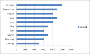
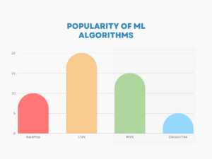
Bar graphs are used to compare the values of different categories or groups. They are best used to display data that is numerical in nature and can be represented in a structured, organized format. Bar graphs can be horizontal or vertical, and can be used to display data in a variety of ways, including grouped bar graphs, stacked bar graphs, and side-by-side bar graphs.
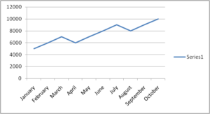
Line graphs are used to track changes over time and to display trends. They consist of a series of points connected by a line and can be used to display data in a variety of ways, including simple line graphs, multiple line graphs, and cumulative line graphs.
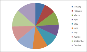
Pie charts are used to represent data as a proportion of the whole. They are best used to display data that is categorical in nature and to display the relationships between different categories.
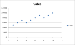
Scatter plots are used to display the relationship between two variables. They consist of a series of points plotted on a set of axes, and can be used to identify correlations between the two variables.
Histograms are used to display the distribution of data. They consist of a series of bars that represent the frequency of data points within a specific range. Histograms are best used to display data that is numerical in nature and to display the distribution of data points over time.
By understanding the different types of graphs and charts, researchers can choose the best visual aid to convey their data and results effectively.
There are several popular software tools for creating graphs and charts for your research paper. These tools are widely used in academia and industry for visualizing data in a visually appealing and professional manner. Here are some of the best software options:
- Microsoft Excel : Excel is a widely used spreadsheet software that comes with a robust charting feature. It allows you to create a wide variety of charts, such as bar charts, line charts, scatter plots, and more. Excel also offers customization options for colors, fonts, and styles to create visually appealing charts.
- MATLAB : MATLAB is a popular software tool used in various fields of research, including engineering, physics, and finance. It has powerful graphing capabilities, with a wide range of plotting functions and customization options. MATLAB also provides advanced data analysis and visualization features, making it suitable for complex research papers.
- R : R is a popular open-source programming language and environment for statistical computing and graphics. It offers extensive libraries for data visualization, such as ggplot2, lattice, and base graphics, which provide a wide range of charting options for creating publication-quality graphs and charts.
- Tableau : Tableau is a powerful data visualization software that provides a user-friendly interface for creating interactive and visually appealing charts and dashboards. It offers a wide range of chart types and customization options, and allows you to connect to various data sources for easy data integration and visualization.
- Adobe Illustrator : Adobe Illustrator is a vector graphics software that provides advanced drawing and design tools for creating high-quality, professional-looking graphs and charts. It offers extensive customization options for colors, fonts, styles, and shapes, allowing you to create visually stunning graphics for your research paper.
- Google Charts : Google Charts is a free web-based tool that allows you to create interactive charts and graphs. It provides a wide range of chart types, such as bar charts, line charts, pie charts, and more, with easy-to-use customization options. Google Charts also offers integration with other Google products, such as Google Sheets, making it convenient for data visualization.
Here’s a comparison of the software tools for drawing graphs and charts:
Note: The cost of these software tools may vary based on different licensing options, usage plans, and academic discounts that may be available.
It’s important to consider factors such as features, customization options, data integration capabilities, interactivity, and cost when choosing the best software for your specific research paper. Depending on your requirements and preferences, you may find one of these software tools more suitable for your needs.
These are some of the best software options for creating graphs and charts for your research paper. Choose the one that best suits your needs and familiarity with the software, and ensure that the resulting graphs and charts are visually appealing and effectively communicate your research findings.
Key factors to consider when choosing the appropriate scale for your charts and graphs, with examples and visual aids:
- Data range: Your chart or graph’s scale should correspond to the range of values in your data. For instance, a bar chart with a scale that only goes up to 1,000 will not accurately depict the full range of the data if the data extends from 0 to 100,000. In this situation, a bigger scale that can hold the entire range of values could be preferable.
- Purpose of the chart or graph: Think about the goal of your graph or chart. Use a smaller scale that zooms in on a specific area of the data if you want to draw attention to a particular trend or pattern. You could wish to zoom in on a certain time period to draw attention to a certain pattern, for instance, if your line chart of temperature trends over time shows trends over time.
- Audience: Consider the audience that your graph or chart is intended to serve. Your data visualisation may need to be more or less explicit and detailed depending on who it is intended for. If you are presenting your study to a general audience, for instance, you might want to use a straightforward bar chart, however, if you are presenting to a more technical audience, you might want to use a more intricate line chart that provides more detail.
- Data distribution: Take your data’s distribution into account. You might want to choose a different scale if your data is skewed or contains outliers in order to better depict the data. For instance, you might wish to use a logarithmic scale if your data are skewed to the right in order to more accurately depict the distribution of the data.
By considering these factors, you can choose an appropriate scale that effectively communicates the data in your chart or graph and enhances the readability and credibility of your research paper.
Handling missing data in charts and graphs can be challenging, but there are several strategies you can use to minimize its impact on the representation of your data:
- Use visual cues: When you have missing data points, you can use visual cues such as dots or a different colour or pattern to indicate the missing information. This helps the reader understand that the data is missing and avoids misleading them with false information.
- Interpolate: In some cases, you may be able to estimate the missing data by interpolating values between two known data points. This can be useful for creating a continuous line chart or graph, but it should be clearly labelled as estimated data.
- Use statistical methods: Statistical methods, such as imputation, can be used to fill in missing data based on patterns in the existing data. This should be done carefully and with caution, as it can introduce bias into the data if not done correctly.
- Leave it out: If the amount of missing data is significant, it may be best to simply exclude it from your charts and graphs. This will avoid giving false impressions of trends or patterns in the data.
- Provide a separate graph or chart: If the missing data is important, you can provide a separate chart or graph that specifically shows the missing data. This allows the reader to see the complete picture, and understand the limitations of the data you are presenting.
When handling missing data, it’s important to be transparent about the methods you used and to clearly label any estimated or imputed data. This will help to ensure the accuracy and reliability of your research paper, and to build trust with your readers.
Handling huge data in charts can be a challenge, but there are several strategies that can help make the data more manageable and easier to understand. Here are some tips for handling huge data in charts:
- Use aggregated data: Aggregating data into categories or grouping similar data points can help reduce the amount of data being displayed and make it easier to understand.
- Filter data: Filtering data to only display relevant information can also help reduce the amount of data in a chart.
- Use multiple charts: If the data is too large to be displayed effectively in a single chart, consider using multiple charts to break down the data into smaller, more manageable parts.
- Use dynamic charts: Dynamic charts, such as interactive line charts or bar charts, allow users to select and view specific data points, making it easier to understand large amounts of data.
- Use colour coding: Color coding data points in a chart can help distinguish between different data sets and make it easier to see trends or patterns.
- Use a smaller time scale: If the data is time-based, consider using a smaller time scale, such as days or weeks instead of months or years, to reduce the amount of data in a chart.
- Use data visualizations: Data visualizations, such as heat maps or treemaps, can help represent large amounts of data in a more manageable and easy-to-understand format.
- Use summary statistics: Summary statistics, such as mean, median, or mode, can help simplify the data and make it easier to understand.
- Use simplifying shapes: Using simplifying shapes, such as circles or squares, can help represent large amounts of data in a way that is easy to understand.
- Consider a combination of methods: Using a combination of the methods above can help effectively handle huge data in charts and make it easier for audiences to understand.
By using these strategies, you can effectively handle huge data in charts and ensure that your data is represented in a clear and concise manner.
A logarithmic scale is a type of scale used in charts and graphs to represent a large range of values in a compact and readable manner. Unlike a linear scale, which represents equal increments of a variable with equal distances, a logarithmic scale represents equal increments of the variable as equal percentages.
The logarithmic scale is particularly useful when dealing with data sets that have an extensive range of values. For example, if a data set has values that range from 1 to 1,000,000, a linear scale would require a very long axis to accommodate all of the values, making it difficult to read and understand. On a logarithmic scale, the axis would be compressed, making it easier to see the trends and patterns in the data.
In research papers, the use of a logarithmic scale can be particularly helpful when dealing with data sets that have a skewed distribution, such as data that has a few extremely large values and many smaller values. By using a logarithmic scale, researchers can better represent the distribution of the data and highlight the trends and patterns that may not be apparent on a linear scale.
It’s important to note that when using a logarithmic scale, the values on the axis are logarithms, not actual values. This means that the increments on the axis represent multiplicative factors, not additive factors. When interpreting a chart with a logarithmic scale, it’s important to consider the scale and understand that the values are represented differently than on a linear scale.
In conclusion, the use of a logarithmic scale can be a powerful tool for researchers when dealing with data sets that have a large range of values. By compressing the axis and representing equal increments of the variable as equal percentages, logarithmic scales can help make data easier to understand and highlight important trends and patterns.
Let’s consider the number of confirmed COVID-19 cases in a country for 10 days. Here is a table representing the data:
As you can see, the logarithmic scale makes it easier to see the relative changes in the number of cases, especially as the values get larger. On a logarithmic scale, equal increments of the number of cases represent equal percentages, rather than equal distances. This allows you to see changes that might not be as noticeable on a linear scale.
To calculate the values for the logarithmic scale, you would take the logarithm (base 10) of each value in the data. Here is an example of how to calculate the logarithm of the value for the 5th day (800 cases):
code log10(800) = 2.903
This means that on a logarithmic scale, the value for the 5th day would be represented as 2.903.
To ensure that your charts and graphs are accessible to all audiences, including those with disabilities, consider the following:
- Use clear and simple language: Use plain language and avoid technical terms when labelling your charts and graphs, to make it easier for everyone to understand the data.
- Provide alternative text: Provide alternative text descriptions for images, including charts and graphs, so that screen readers can describe the content to users with visual impairments.
- Use accessible colours: Avoid using colour as the only means of conveying information, and ensure that the colour contrast between the text and background is high enough to be easily readable by people with colour vision deficiencies.
- Use clear and concise labels: Label the axes and data points clearly and concisely, and include units of measurement where appropriate.
- Use accessible file formats: Save charts and graphs in accessible file formats, such as PDF or SVG, which can be easily read by assistive technology.
- Consider touch and keyboard navigation: Make sure that your charts and graphs are usable for people who navigate the web using touch or keyboard controls, by ensuring that all interactive elements can be operated using keyboard commands.
- Test for accessibility: Test your charts and graphs with assistive technology, such as screen readers, to ensure that they are fully accessible to all users.
By following these guidelines, you can ensure that your charts and graphs are accessible to everyone, regardless of their abilities. This will help to increase the reach and impact of your research paper, and promote greater inclusivity in the scientific community.
It is easier for readers to comprehend complex material when it is presented visually through charts and graphs. It’s crucial to think about whether the charts and graphs you create for a research paper are subject to copyright laws and whether you require permission to use them.
Original works of authorship, such as literary, musical, theatrical, and aesthetic works, are protected by copyright law. If they are made by a person or group and have enough creative expression, charts and graphs might be regarded as original works of authorship.
Research articles frequently utilise charts and graphs that are based on publicly accessible data, such as statistics from the government or data from surveys.
These kinds of information are typically regarded as being in the public domain and can be utilised without a licence.
Charts and graphs produced by an individual or group, however, and containing a considerable amount of original creative work may be protected by copyright legislation.
In certain situations, you might need to ask the copyright holder for permission before using the graph or chart in your research report.
When using charts and graphs in a research paper, it’s important to consider the source of the data and whether the chart or graph is protected by copyright law. If you are unsure, it’s always best to err on the side of caution and to obtain permission from the copyright owner before using the chart or graph in your research paper.
When using charts and graphs in research papers, it’s important to avoid common mistakes that can undermine the effectiveness of your data visualization. Here are some common mistakes to watch out for:
- Overcomplicating the visualization: Avoid using too many colours, patterns, or elements in your chart or graph, as this can make it difficult for the reader to understand the data. Stick to simple, clean designs that emphasize the data.
- Ignoring the scale: Be careful when choosing the scale for your chart or graph, as the wrong scale can distort the data and give a false impression of the data.
- Improper labelling: Make sure to label the axes of your chart or graph clearly and accurately, and include units of measurement where appropriate.
- Not using appropriate chart or graph types: Choosing the right chart or graph type is important for effectively communicating the data. For example, if you have categorical data, use a bar chart, not a line chart.
- Ignoring the data distribution: Consider the distribution of your data, and adjust the scale and chart type accordingly. For example, if your data is skewed, you may want to use a logarithmic scale to better represent the data.
- Overloading the chart or graph: Avoid putting too much data into a single chart or graph, as this can make it difficult for the reader to understand the data. Instead, break the data down into multiple charts or graphs as needed.
- Using outdated or irrelevant data: Make sure to use the most up-to-date and relevant data in your charts and graphs, as outdated or irrelevant data can undermine the credibility of your research paper.
By avoiding these common mistakes, you can ensure that your charts and graphs effectively communicate the data.
In conclusion, charts and graphs play a crucial role in visualizing and communicating data in research papers. The use of charts and graphs allows researchers to convey information effectively and efficiently, helping the reader to understand complex data easily. Whether it’s a bar graph, scatter plot, heatmap, or histogram, each type of chart has its unique strengths and weaknesses.
Choosing the right type of chart and using it effectively is crucial to getting your message across in a research paper. Additionally, using a logarithmic scale and ensuring accessibility to all audiences can make your charts and graphs more effective and user-friendly. To make the most of charts and graphs in research, it is important to keep in mind the guidelines, best practices, and common mistakes to avoid.
Frequently Asked Questions
The number of graphs and charts in a research paper can vary depending on the nature of the research, the specific requirements of the paper, and the preferences of the author or the guidelines of the target journal or conference. There is no fixed rule or standard for the exact number of graphs and charts in a research paper. However, it is generally recommended to use graphs and charts judiciously, ensuring that they are relevant, clear, and effectively convey the research findings.
The size of graphs and charts in a research paper should be chosen carefully to ensure that they are clear, readable, and effectively convey the information to the readers. Here are some general guidelines for the size of graphs and charts in a research paper: Legibility: The graphs and charts should be large enough to be easily read and interpreted by the readers, even when printed or displayed at a reduced size. The font size of labels, legends, and annotations should be legible, typically ranging from 10-12 points, depending on the font type. Proportionality: The size of the graphs and charts should be proportional to the available space in the paper and the content being presented. Avoid using excessively small graphs or charts that may be difficult to understand or interpret. Clarity: The graphs and charts should be clear and not overly cluttered. Use appropriate line thicknesses, marker sizes, and bar widths that are visually clear and distinguishable. Avoid overcrowding the graphs or charts with too much information, which may make them difficult to read or interpret. Journal/Conference Guidelines: Follow the guidelines of the target journal or conference for the size of graphs and charts. Some journals or conferences may have specific requirements or recommendations for the size of visuals in research papers. Consistency: Ensure that the size of graphs and charts is consistent throughout the paper. Use a consistent style for fonts, colors, and other graphical elements to maintain a cohesive visual appearance. Accessibility: Consider accessibility requirements, such as ensuring that the size of graphs and charts is suitable for readers with visual impairments. Providing alternative text descriptions for visuals can also enhance accessibility.
Yes, it is common practice in research papers to place charts and graphs at the end of the paper as appendices or as separate sections, especially if they are large or numerous. This can help improve the flow and readability of the main text, as readers can refer to the visuals in the appendices or separate sections as needed without interrupting their reading of the main content.
Yes, you can place charts and graphs at the end of a research paper as single-column visuals, even if the main text is formatted in two columns. However, it’s important to ensure that the placement of visuals at the end of the paper does not disrupt the overall organization and readability of your research paper.
Upcoming Events
- Visit the Upcoming International Conferences at Exotic Travel Destinations with Travel Plan
- Visit for Research Internships Worldwide

Recent Posts
Copyright © 2024 Research Voyage
Design by ThemesDNA.com

Ultimate Guide on Creating Comprehensive Graphs for Your Research Paper
If you have two minutes to skim through a research paper, what would you go through? Probably the introduction, the conclusion, and? The graphs? That’s right! Graphs are the best way to visually illustrate your research paper. Research papers usually have massive amounts of data and complicated concepts to explain. And, graphs can be used […]
If you have two minutes to skim through a research paper, what would you go through? Probably the introduction, the conclusion, and? The graphs? That’s right!
Graphs are the best way to visually illustrate your research paper. Research papers usually have massive amounts of data and complicated concepts to explain.
And, graphs can be used to represent these data and concepts in a visual, easy to understand manner. Graphs can effectively help to deliver the message that you want to convey.
Also, adding graphs to your research paper can make it much, much more interesting. Something that might be needed in an otherwise monotonous research paper.
Apart from visually representing your data, graphs can also give a concrete angle to the idea of your hypothesis and research paper.
But, simply adding graphs for the sake of it won’t do. Graphs are meant to make your thesis sound more interesting and explain things better. But, you can easily go wrong with it by adding graphs that do not necessarily complement your research paper.
A good graph can make the world of difference to your research paper. It can make the text of your research paper sound more self-explanatory. If you are a student, then this means you’ll get better grades for your research paper.
So, in this ultimate guide, let’s look at some super-helpful tricks and tips on adding comprehensive graphs to your research paper to make them more interesting and appealing.

Know Your Audience
Knowing your primary audience is important to understand before you decide on the types of graphs that you want to add.
Not everyone understands graphs the same way. So, ensure that you understand your audience first before proceeding with the addition of graphs to your research paper.
Think about who is going to read your research paper. Is it a scientist, preschool teacher, or your neighbor who works in a finance firm? Different types of graphs would be suitable for people with different levels of understanding.
Based on the capacity of your audience and how they will perceive your research paper, you can decide on the types of graphs that best suit them. Here’s a list to help you out:
If your audience is less experienced, then you should go with graphs that are easier to understand without any extensive knowledge about graphs. Here are some such types of graphs:
- Linear graph
- Multi-set bar graph
If your audience is well versed with the basics of your research paper’s topic and is from your industry, then you can go with more advanced types of graphs. Here are some advanced types of graphs which you can use for a more experienced audience:
- Stacked bar graph
- Stacked area graph
- Spiral plot
- Point and figure chart
- Choropleth map
- Candlestick chart
Imagine if you were to go for a Choropleth map for an inexperienced audience for your research paper. It would be a total disaster! Your message would not be delivered as efficiently.
Similarly, a simple linear graph might seem amateur in a research paper meant for scientists, when the concept could have been explained with the help of a more advanced graph.
Hence, knowing your audience is very important to understand while you write your research paper and create comprehensive graphs for it.
Keep a Check on the Aesthetics
While creating and adding graphs to your research paper, it is also important to think about its aesthetics too. There is no point in adding a graph if it looks messy and unclear. Right from the colors, the fonts, to the placement of your graphs, everything counts.
The use of the right colors can completely transform your graphs and your research paper. Whereas if you add colors that look off-putting, then your audience might not be able to read and understand your graphs well. They might even put down your research paper right away.
Colors have the ability to enhance your graphs and improve their readability. For instance, if you use different colors to represent different data points, then your graph will instantly look more readable for your audience.
The contrast of colors is also an essential aspect to consider. You should avoid using dark backgrounds with lighter colored fonts and plots. As this will decrease the readability.

As a general rule, have a lighter background and contrasting colored elements. For example, if you use a white background for your graph, do not plot your graphs with yellow-colored lines as these will not be distinguishable. Instead, use darker colored lines.
Fonts of your graphs are also a very crucial element. If you use fonts that are too large, then your graph might look messy.
While, if you use fonts that are too small, then your graph might not be readable. Readers might have to strain their eyes to understand your graph. Hence, use the right size for the fonts in your graphs.
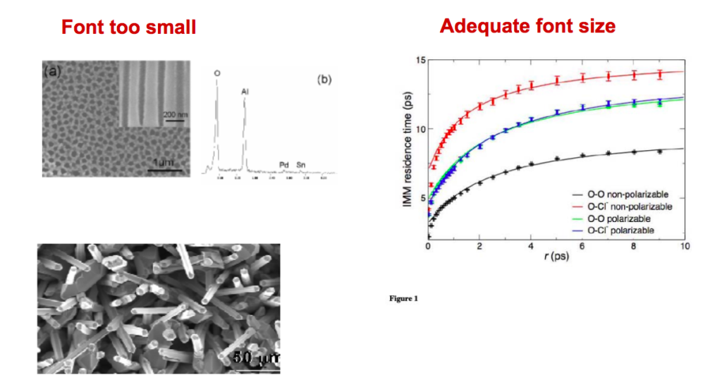
Also, try not to choose fancy fonts that are not easily understandable. Go with the standard serif fonts. You should also format your fonts properly. For example, use bold and italic fonts wherever highlighting is necessary. Do not bold the entire text. Use it selectively.
Icons can be a great addition to your research paper’s graphs. They can make your research paper self explanatory. You can use icons to label charts or graphs. Or you can also use them to label different elements of your graphs.
While using icons, you should, again, think about the color contrast. Your icons should look clear and distinguishable in the background. For example, use a darker color icon on a lighter colored background.
The fonts inside your icons also matter. Whether you design your own fonts, or you use make my graph tools, you must ensure that the fonts inside icons (if any) are readable without having to strain the eyes.
Make Your Readers Visualize Effectively
The point of adding any graph, chart, or illustration to your research paper is to help your readers easily understand your point.
Reading and understanding research papers cannot be everyone’s cup of tea. Hence, you should make persistent efforts to make it as easy-to-understand as possible.
Your audience will be able to best understand your graphs only when they can visualize them effectively. Visualization is easy to say, but difficult to implement.
You need to ensure that your graphs are designed in a way so that they can be visualized effectively. For this, you need to look at your graph with a fresh set of eyes.
If your graph seems a little too complicated, try to dial it down by breaking down a single graph into multiple smaller graphs. Or, you can also combine two or more smaller graphs to represent everything on a single graph, if that seems like a better representation.
Try to understand how your readers, who do not know entirely about your topic, look at the graphs. Will they be able to visualize and understand the message you are trying to convey?
If not, then recreate better graphs. If your graph looks plain, take the help of online make my graph tools that can aid you to create beautiful, comprehensive graphs at supper affordable rates.
If you nail this part, then your research paper will be a great resource for everyone to refer to. And, your graphs and visual representations will also be widely shared in your industry.
Know What You Want to Convey
The message you want to deliver or the concept you want to explain to your readers with the help of graphs is also important to consider.
What exactly do you not want to convey? Do you want to add a visual representation of data? Do you want to create scientific infographics that easily explain your research paper’s findings? Do you want to visually explain the differences between the two sets of data?
Based on the message that you want to convey, you can create different types of graphs. Here are a few types of graphs that can help you get started:
Hierarchical
Any concept that forms a hierarchy can be easily represented using hierarchical graphs.
You can create beautiful graphs with hierarchical representations using an easy-to-use online graphic maker tool like MindTheGraph.
A histogram is a graph using which you can represent the frequency distribution of a set of continuous data. You can visualize the shape of the data points and their underlying distribution.
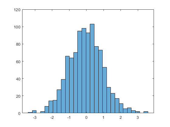
If your research paper consists of data specific to geographical locations, then you can represent that result with the help of geospatial data. Geospatial graphs represent geographical locations through latitudes, longitudes, or the names of geographic locations.
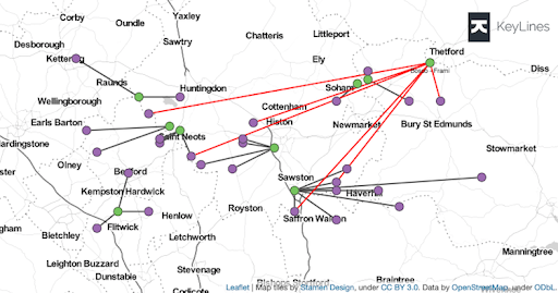
Multidimensional
Multidimensional graphs can be used to represent data that can be better visualized and represented in more than two dimensions. These can be very effective in helping your readers effectively visualize your data and findings.
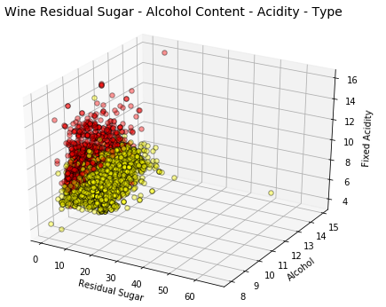
You can easily create beautiful graphs in multidimensional using online infographic maker tools like Mind the Graph.

Here’s an example of a template that you can use for creating a multidimensional infographic for your research paper.

Temporal graphs can be used to represent data that usually change with time. You can plot different data points with one of the axes of your graph as the time axis.
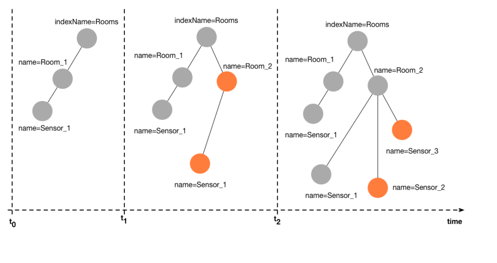
Pie charts are a circular statistical graph that can be used to represent different proportions of data.
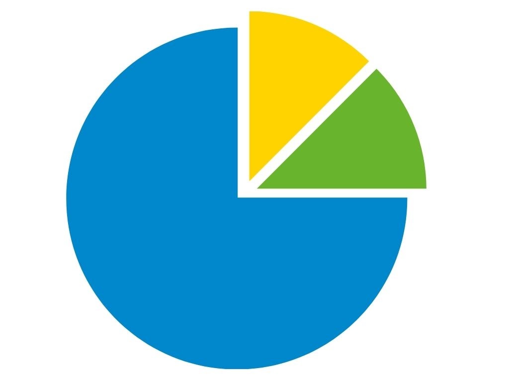
Scatter plots
Scatter plots can be used to explain the relationship between two sets of data in a visual format. In scatter plots, dots are used to represent different numerical values.
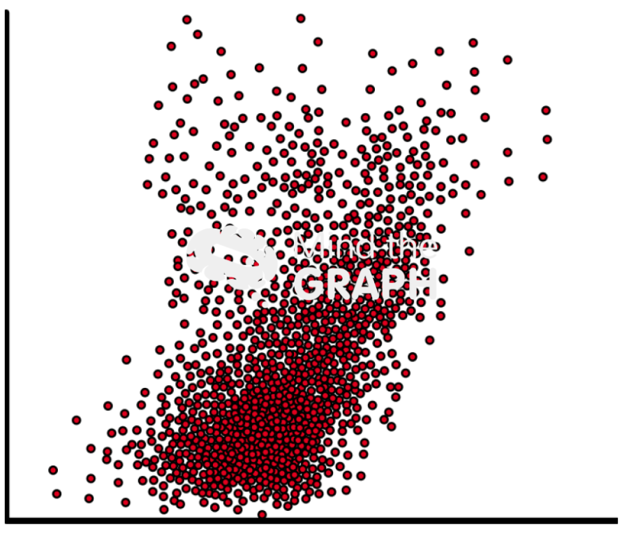
Timetable charts
Timetable charts are used to represent scientific data in the form of timelines.
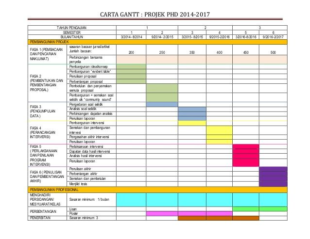
Venn diagrams
Venn diagrams are one of the most commonly used formats for visual presentation. Venn diagrams are used to show all possible logical relations amongst a finite group of things. These can be great for representing the similarities and differences between two or more things.
Stacked area graphs
A stacked area chart or graph is an extension of an area chart. Here, several groups of data are represented in the graph by stacking them, one above the other.
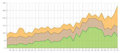
Stream graphs
Stream graphs are another form of stacked area graphs. In a stream graph, instead of stacking the layers, one above the other, layers are positioned around a central axis.
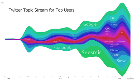
Stacked bar graphs
Stacker bar graphs are similar to stacked graphs, except where the same concept is applied to bar graphs. Different groups of data are represented by stacking them in the same bar graph, one above the other.

Parallel sets
Parallel sets are used to represent the flow and proportions of data. These represent data frequencies instead of individual data points.
Multi-set bar charts
Multi-set bar charts, also known as clustered bar charts, are a type of bar chart. Here, two or more data sets are represented side by side for better understanding and interpretation. All the bar charts use a common axis that may be X-axis or Y-axis.
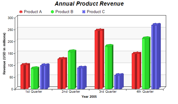
Ask Others to Share Their Feedback
Lastly, a new set of eyes to review and critique your research paper’s graphs is almost as crucial as the process of designing the graphs.
You would probably love and admire the graphs you have created. But others might have a completely different opinion about it. Hence, it is best to get others’ opinions on this.
The best way to go about it is to pick people who most likely fit your primary audience. For example, if your research paper is meant for readers experienced in your industry, then pick someone with the same kind of industry experience.
Ask them to review your graph, analyze their initial reaction, and gather their feedback. Are they able to understand your graphs? Is your graph readable and easy-to-digest without you having to explain it in depth?
Asking and answering these questions will help you understand the most likely reaction from your primary audience.
If the reviewer finds it difficult to understand, you should consider simplifying our graphs. You can do this either by using a simpler type of graph or using multiple graphs in place of one.
Whereas, if the reviewer finds the graphs unnecessary or amateur, then you might consider using more advanced graphs or removing them altogether.
We can conclude by saying that graphs can make or break your research paper. People can perceive your research paper in a completely different light if you have added the right graphs to it.
Right from selecting the type of graphs, to the colors and fonts to use, everything must be carefully thought upon before you start creating graphs.
Take your time and create good comprehensive graphs for your research paper. And, by doing that, you will find that people appreciate your work a lot more than they would otherwise.

Subscribe to our newsletter
Exclusive high quality content about effective visual communication in science.
About Fabricio Pamplona
Fabricio Pamplona is the founder of Mind the Graph - a tool used by over 400K users in 60 countries. He has a Ph.D. and solid scientific background in Psychopharmacology and experience as a Guest Researcher at the Max Planck Institute of Psychiatry (Germany) and Researcher in D'Or Institute for Research and Education (IDOR, Brazil). Fabricio holds over 2500 citations in Google Scholar. He has 10 years of experience in small innovative businesses, with relevant experience in product design and innovation management. Connect with him on LinkedIn - Fabricio Pamplona .
Content tags
Educational resources and simple solutions for your research journey
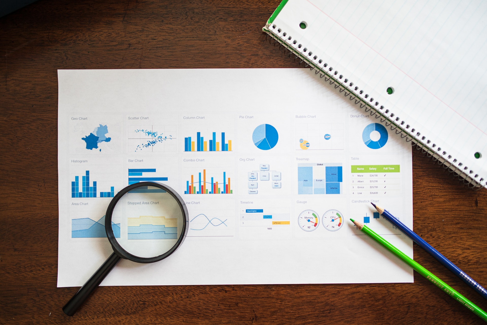
Data Visualization: How to Present Your Research Data Visually
The academic and scientific community produces large amounts of data through their research, and data visualization is a key skill for researchers across all disciplines. Presenting qualitative data visually from one’s research can transform the final output, and one does not have to spend enormous amount of time to accomplish this. Researchers who need to communicate quantitative data have several options to present it visually through bar graphs, pie charts, histograms and even infographics. However, communicating research findings based on complex datasets is not always easy. This is where effective data visualization can greatly help readers. Data visualization is the representation of information and data in a pictorial or graphical format highlighting the trends and outliers and making it easier to understand. Effective use of data visualization techniques helps to focus readers’ attention on critical information, in a way is both simple and engaging.

Many researchers are often under the false impression that presenting qualitative data visually is a complex exercise, but it is not. Today, there are numerous qualitative data visualization tools and techniques that can be used by both beginners and experts alike. Using data visualization to communicate important data can enhance the impact of the researcher’s work thereby making it more meaningful and engaging to potential readers. Adding visuals like graphs and charts can make it easier for not just for researchers to communicate experimental results and share details of interesting new discoveries but also allows readers to analyze and understand complicated data sets and concepts. A study in The Economist revealed the number of citations jumped 120% when a research paper included infographics. 1
Let us look at some ways to make the best use of data visualization techniques that will help present your qualitative research data and information effectively.
Table of Contents
Pair the right kind of visuals to convey specific data sets
The human brain is wired to quickly analyze and understand visual cues which is why it is important to add visual elements in your research paper. Plotting data using charts, graphs and infographics allows readers to quickly identify underlying patterns of data that would otherwise be difficult to comprehend when reading through paragraphs of text. However, using the wrong kind of visuals can be misleading, and reduce readability and comprehension.
Today, with more and more scientific knowledge being conveyed visually via social media, researchers are experimenting with communicating research through different types of visuals. However, using the right kind of visuals is imperative to ease the public understanding of science.
In fact, an interesting study in the Journal of the American Statistical Association by William Cleveland and Robert McGill sheds light on how human perception affects how we decipher graphic displays of data; this made some kinds of charts easier to understand than others. The statisticians were able to prove that charts based on the lengths of bars or lines, such as in a standard bar chart were the easiest to read – especially, when trying to discern small differences between values. Pie charts on the other hand were acceptable only in limited contexts so were rarely the right choice. 2
Focus on balancing form and function
There are several data visualization software and programs available to researchers today that simplify the process of presenting data visually. What needs to be kept in mind, however, is that quantitative data visualization is not just about beautifying graphs to make them look better. Neither is it about heaping information into an infographic to communicate different aspects of research. Researchers must understand that to be effective, data visualization must be a delicate balance between form and function. While a plain graph could be too boring to attract and hold reader attention a beautiful visual could also fail in its endeavor to communicate the right message if it is not presented properly. The data and the visuals need to work together to create a compelling narrative that combines research analysis with storytelling.
Be aware of the use of colors and shapes
While incorporating quantitative data visualization techniques it is recommended not to rely only on the default templates available within software and programs but instead customize and define the layout according to your specific needs. Choosing the right colors and shapes to indicate various categories is very important. For example, it would be appropriate to use light colored text on a darker background to enhance readability. Researchers can also choose to use different shapes to indicate separate data sets and categories of information and use varying sizes to stress the frequency of data. One can also use similar vectors to add a touch of ingenuity to the visuals being used. It is best to avoid using vivid effects and abstract images for denoting differences in data as they can distract readers from key information points being conveyed. Most importantly, avoid adding too many visuals or graphics. Researchers must use visuals only where necessary and align them with the information provided.
While many early career researchers and academics might find it challenging to visualize qualitative data and present it in a manner that is easily understood by an audience, this is an art that should be cultivated and can be mastered. This is where Mind The Graph comes in help researchers get more creative with science communication by offering them a simple way to present data visually. A powerful AI tool for scientists, Mind The Graph is home to the world’s largest scientifically accurate illustrations gallery with over 40,000 illustrations across more than 80 research fields. Choose a format to communicate your research and use one of the 200+ pre-made templates to create powerful scientific infographics, posters, graphical abstracts, and presentations for your own research. It’s a quick, effective, and powerful way to communicate your science to the world. And the best part is that you can now get Mind The Graph at a steal by subscribing to Researcher.Life , which unlocks access to this data visualization tool as well as other premium AI tools and services designed to help you succeed.
References:
- Graphic Details, The Economist, June 2016. Available at https://www.economist.com/science-and-technology/2016/06/16/graphic-details
- Mason, B. Why scientists need to be better at data visualization. Knowable Magazine, 2019. Available at https://knowablemagazine.org/article/mind/2019/science-data-visualization
Related Posts

How to Calculate H-Index in Google Scholar?

What is a good h-index?

IMAGES
VIDEO
COMMENTS
In a table, readers can look up exact values, compare those values between pairs or groups of related measurements (e.g., growth rates or outcomes of a medical procedure over several years), look at ranges and intervals, and select specific factors to search for patterns. Tables are not restrained to a specific type of data or measurement.
Reference 1. The background of the chart should be in good contrast to the chart itself, to make certain that the data stands out prominently. The axes should not be named simply “temperature” & “time” for instance unless it provides a complete clarification of the segments. Choose the graph’s layout to maximize readability.
Tables and figures are each numbered separately, in the order they are referred to in your text. For example, the first table you refer to is Table 1; the fourth figure you refer to is Figure 4. The title should clearly and straightforwardly describe the content of the table or figure. Omit articles to keep it concise.
They come in the form of graphs, charts, drawings, photos, or maps. Figures provide visual impact and can effectively communicate your primary finding. Traditionally, they are used to display trends and patterns of relationship, but they can also be used to communicate processes or display complicated data simply.
Placement of figures in a paper. There are two options for the placement of figures (and tables) in a paper. The first is to embed figures in the text after each is first mentioned (or “called out”); the second is to place each figure on a separate page after the reference list. An embedded figure may take up an entire page; if the figure ...
Tables and figures in scientific papers are wonderful ways of presenting data. Effective data presentation in research papers requires understanding your reader and the elements that comprise a table. Tables have several elements, including the legend, column titles, and body. As with academic writing, it is also just as important to structure ...
Figures in APA Style (7th ed.) Figures include visuals such as charts graphs, pictures, maps, etc. When inserting a figure in your work, include the following information (also exemplified in Figure 1): Figure note, double-spaced below the table after the label “note” in italics: Note.
Best Practices for Using Graphs and Charts in Research Papers. There are several best practices that researchers should follow when using graphs and charts in their research papers. These include: Choosing the Right Type of Graph or Chart. It is important to choose the right type of graph or chart to effectively convey the data and results.
Similarly, a simple linear graph might seem amateur in a research paper meant for scientists, when the concept could have been explained with the help of a more advanced graph. Hence, knowing your audience is very important to understand while you write your research paper and create comprehensive graphs for it. Keep a Check on the Aesthetics
The human brain is wired to quickly analyze and understand visual cues which is why it is important to add visual elements in your research paper. Plotting data using charts, graphs and infographics allows readers to quickly identify underlying patterns of data that would otherwise be difficult to comprehend when reading through paragraphs of text.